As datasets continue to become larger and more complex, even the most seasoned data experts can struggle to interpret the findings of data science work accurately. Data visualization has become a crucial aspect of data analytics and data science, helping practitioners drive business value with data.
Many data science teams leverage data visualization to some degree, yet they still face challenges related to handling large, complex data sets and delivering actionable insights. Python data visualization can help organizations overcome these obstacles and create high-quality visualizations that communicate key messages to stakeholders. The Python ecosystem has many open-source libraries for data visualization — including Matplotlib, Seaborn, Plotly, and Bokeh — to make things even easier for data scientists.
In this guide, we’ll discuss common data visualization challenges, the most essential Python libraries, and how to get started with data visualization.
Common Challenges with Python Data Visualization
Choosing the right Python library for a particular use case is crucial for overcoming the challenges related to data visualization. Before we examine specific libraries, let’s consider some of the most common data visualization challenges:
- Handling large and complex data sets can be a problem for some data visualization tools. However, the Pandata open-source data analysis stack curates Python libraries based on certain criteria, including scalability standards. Choosing data visualization libraries from this collection can ensure that large-scale visualizations are responsive and render correctly.
- Integrating visualizations into existing workflows, such as web apps and reports can be difficult. Some Python libraries like Plotly and Bokeh are ideal for embedding visualizations into modern web browsers while others are ideal for working with Jupyter Notebooks.
- Ensuring clarity for visualizations requires selecting the right plot type, appropriate color schemes, and relevant text annotation. A Python library that supports many different graph types and customization options is useful for creating visualizations that clearly communicate data insights.
Essential Python Libraries for Data Visualization
Since Python has such an active and diverse ecosystem, there are many different data visualization libraries to consider. Here are some of the most popular libraries, each of which supports a specific aspect of data visualization:
- Matplotlib: A comprehensive Python library for creating static, animated, and interactive visualizations. This is one of the oldest and most popular libraries for information visualization, with an extensive range of 2D plot types and output formats.
- Seaborn: A statistical data visualization library based on Matplotlib. This library offers additional plot types and more advanced options out of the box.
- Plotly: An interactive, browser-based graphing library with support for over 40 unique chart types.
- Bokeh: An interactive data visualization library for modern web browsers. This library enables users to create visualizations without writing JavaScript.

| Python Library | Overview | Use Case |
| Matplotlib | Create, customize, export, and embed visualizations | Static, animated, and interactive visualizations |
| Seaborn | Create graphics using a high-level interface | Attractive and informative statistical graphics |
| Plotly | Create, share, and embed interactive charts | Interactive, publication-quality graphs |
| Bokeh | Create JavaScript-powered visualizations in Python | Interactive visualization for modern web browsers |
Getting Started with Python Data Visualization
In this section, we’ll show you how to install Python, import the most popular data visualization libraries, prepare data for visualization using NumPy, and create basic plots.

Advanced Visualization Techniques
Now that you’ve explored the basics of data visualization with Python, we can examine more advanced techniques, such as multi-plot figures, 3D plots, geographic data visualization, and interactive plots.
If you want to continue expanding your knowledge about Python, consider Anaconda’s certification course: Data Analysis with Python in Excel. Our courses help data science and data analytics professionals learn the skills they need to succeed in the rapidly evolving technology industry.
Data Storytelling with Python Visualizations
Data storytelling is a way to communicate insights from data to stakeholders using narratives and visualizations. Analyzing data using modern data science techniques is a complex process, so data storytelling is important for making findings accessible and understandable to a non-technical audience.
When conveying data insights, it’s crucial to choose the right visualization type. Certain charts and graphs are more suitable for highlighting trends, drawing comparisons, or making the connection between different variables. More advanced visualizations like 3D graphics and interactive plots can also be helpful for capturing the viewer’s attention.
In addition, establishing a visual hierarchy — where individual elements are organized based on their importance to the overall message — is useful for guiding the viewer’s attention. Focus elements, such as certain colors and shapes, can emphasize key data points and help drive the narrative.
Finally, integrating text annotations and titles can help form a narrative or storyline that puts the data insights in context. This also allows data scientists to provide clear recommendations and make the data insights more actionable.
Python Data Visualization with Anaconda
Data visualization is crucial for communicating insights and maximizing the value of data science. Although creating high-quality visualizations can be challenging, Python’s extensive ecosystem of libraries and tools can help overcome these challenges.
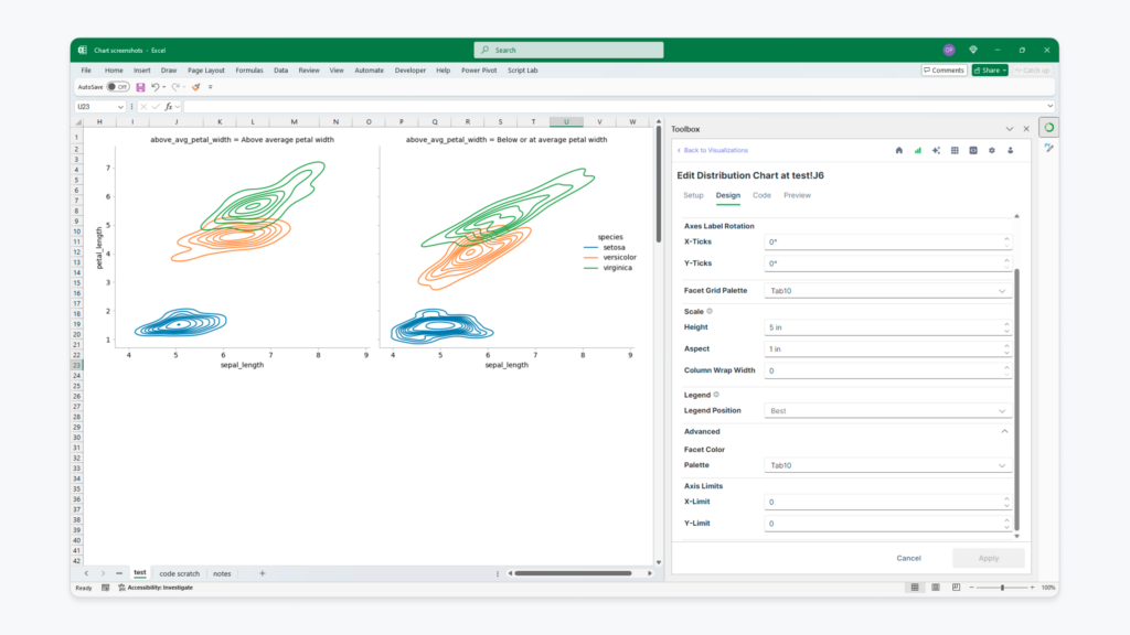
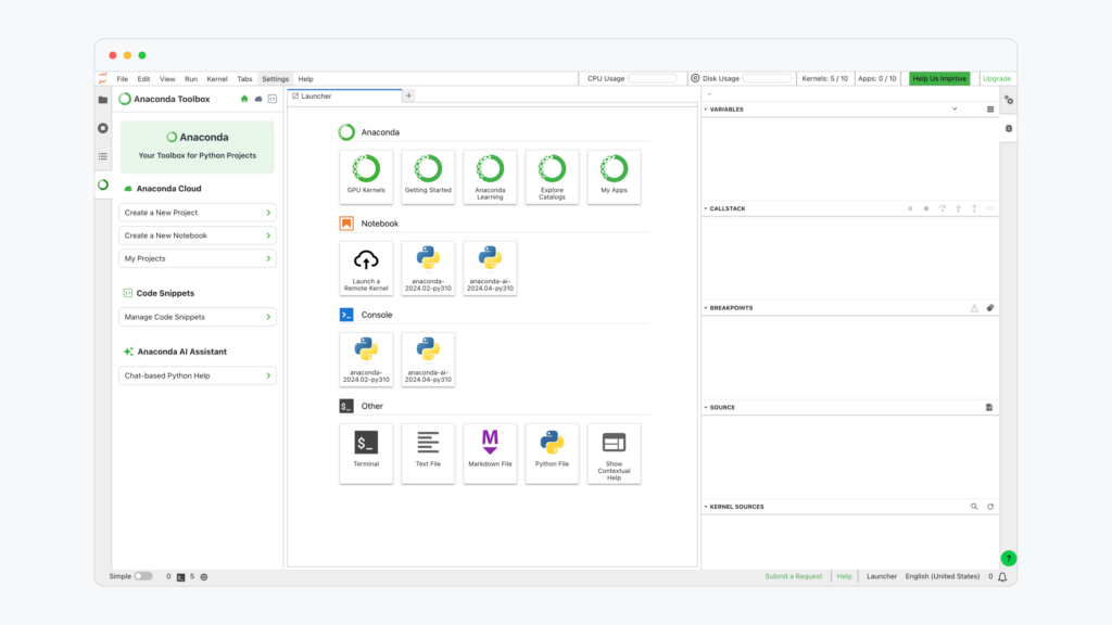
Data scientists should also consider leveraging a solution like Anaconda to streamline their Python data science workflows. Anaconda is a comprehensive platform for data science built on open-source technologies and the thriving Python community. In addition to machine learning and AI capabilities, Anaconda has a wide range of features and integrations for data visualization including custom visualizations with Python in Excel.

The Anaconda platform comes with a built-in package manager called Conda, which makes it easy to install, update, and manage Python libraries commonly used for data visualization, such as Matplotlib, Seaborn, Plotly, and Bokeh. This simplifies the process of setting up and maintaining a robust data visualization environment.
Anaconda also comes with many popular data manipulation, analysis, and visualization libraries pre-installed, such as Pandas, NumPy, and SciPy. This means users can start creating visualizations immediately without having to manually install these packages.
Finally, Anaconda comes with Jupyter Notebook pre-installed, which provides an interactive environment ideal for creating and sharing data visualizations. Jupyter Notebooks allow users to combine code, visualizations, and explanatory text in a single document to streamline data storytelling.

Request a demo to see if Anaconda is right for your data visualization workflows. Or, if you’re curious to experiment with Anaconda on your own, you can get started for free.