Creating a chart
Create a new chart using the following steps:- Under Visualizations, click Visualize with Python.
- Click + New Chart.
- Select a chart type from the list of charts.
-
Select your source data range and configure the controls on the Setup tab.
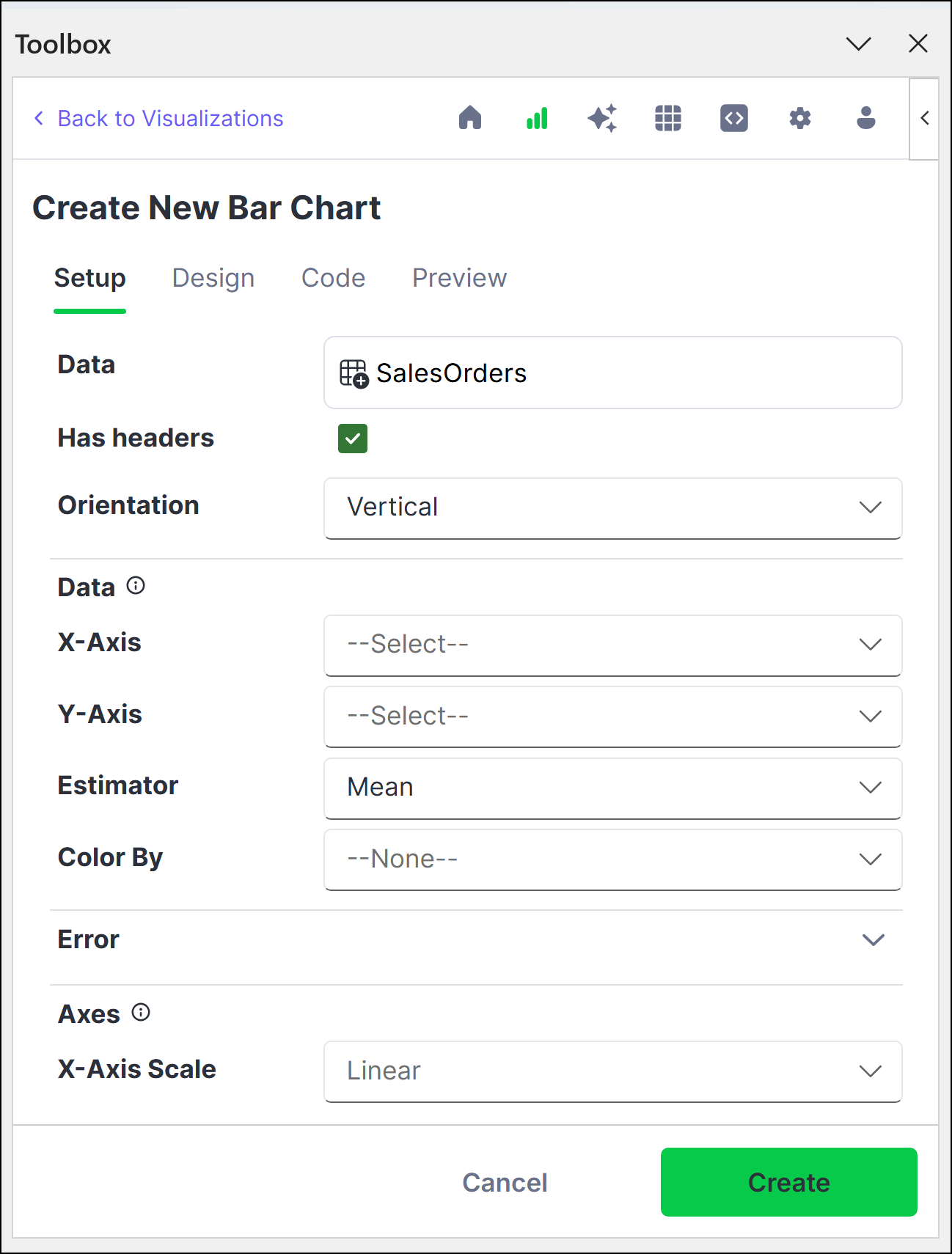
- (Optional) Customize your chart further with the options provided on the Design tab.
- Click Create.
-
Set the location for the chart to render, then click OK. The chart renders within the confines of the cell.
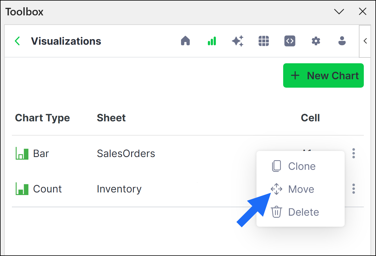
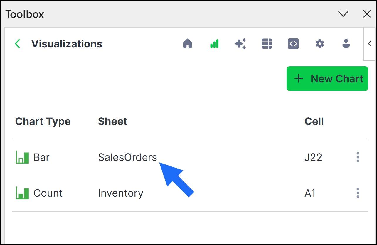
To move a chart to a new cell after creating it, click actions beside the chart, then click Move.
-
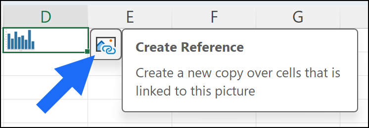
To properly view the chart, select the cell, then click Create Reference.
The chart displays as an enlarged copy. If you’d prefer to view the enlarged chart only when needed, you can delete the enlarged copy and recreate it at any time.
Editing a chart
Edit an existing chart by adjusting the parameters provided on the Setup and Design tabs or by manually configuring the code on the Code tab.- Setup and Design
- Code
-
From the Visualizations home page, click the chart you want to edit.
- Make any necessary changes on the Setup and Design tabs, then click Apply.