Enterprise Data Science, Machine Learning, and AI
Jul 24, 2024
Anaconda Accelerates AI Development and Deployment with NVIDIA CUDA Toolkit

At Anaconda, we believe that accessible tools for data analysis empower individuals to discover insights that can lead to meaningful change. As Earth Day nears, considering how data and artificial intelligence can illuminate our understanding of critical infrastructure and environmental impact is top of mind. The democratization of data science through intuitive AI interfaces particularly creates new opportunities for environmental stewardship and informed decision-making.
Lumen AI, our natural language interface for data exploration, demonstrates how conversational AI can transform raw information into visual narratives that inspire action. In this article, we’ll explore how Lumen can help us visualize and understand our energy landscape, bringing clarity to complex relationships between power generation facilities and data centers across the United States.
Environmental challenges are inherently data challenges. By bringing together diverse datasets and visualizing their relationships, we can uncover patterns that might otherwise remain hidden. For Earth Day, I decided to explore two critical infrastructure datasets:
These datasets provide a window into the complex energy ecosystem that powers our digital world. By understanding where power is generated and consumed, we can identify opportunities for efficiency improvements and sustainability initiatives.
First, I needed to gather the necessary data. The EPA provides comprehensive information about power plants, while data center information is available through geographic service endpoints. With a few simple commands, I downloaded everything needed for our exploration:
wget https://www.epa.gov/system/files/other-files/2025-01/plant-specific-buffers.csv

wget https: //services1.arcgis.com/aT1T0pU1ZdpuDk1t/arcgis/rest/services/echo_data_centers_518210/FeatureServer/0/query?where=1=1&outFields=*&returnGeometry=true&f=geojson
After renaming the files appropriately, we can launch Lumen AI to begin my data journey:
lumen-ai serve plant_specific_buffers.csv power_plants.csvWhat makes Lumen unique is its ability to understand natural language queries. Instead of writing complex SQL queries or visualization code, I can simply ask questions about the data. This conversational approach removes barriers to insight, making data analysis accessible to everyone regardless of technical background.
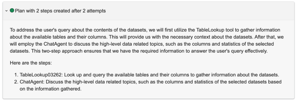
When I first loaded the data, I asked Lumen for an overview. It intelligently developed a plan with first steps to explore the data, providing rich context before answering my questions and arriving at an answer:


To get better acquainted with the datasets, I asked Lumen to show me the power plants’ data. It responded with a simple SQL expression: SELECT * FROM READ_CSV(‘plant_specific_buffers.csv’) and rendered the results in a Graphic Walker table. This interactive table allowed me to scroll through records and get a sense of the data structure.

One category that immediately caught my attention was “Fuel Type.” Rather than writing another query, I simply clicked on the filter icon within Graphic Walker to see a breakdown of the column values. This seamless blend of natural language querying and interactive UI elements makes data exploration intuitive and efficient—you don’t need to be a data scientist to uncover patterns and relationships.

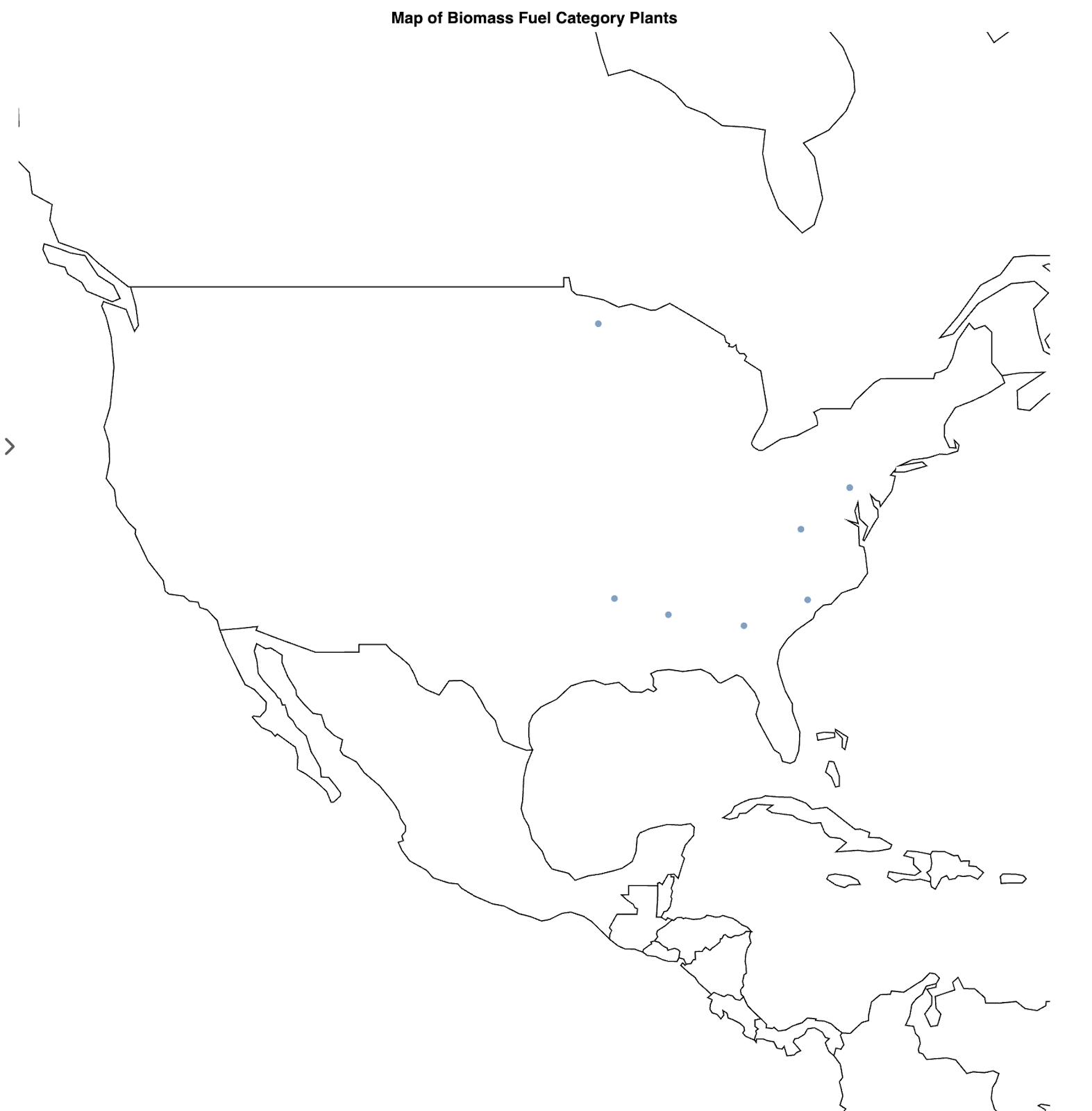
With a better understanding of the data structure, I was ready to dive into geographic visualization. I asked Lumen to Create a map of plant power fuel category = biomass, and it elegantly responded with a visualization showing these renewable energy facilities across the country.
The most surprising finding? There were only seven biomass power plants in the entire dataset, raising questions about the distribution of renewable energy infrastructure compared to traditional fossil fuel plants.
max_width: 1200

min_height: 300

pipeline:

  source:

    tables:

      biomass_plants: |-

        SELECT *

        FROM READ_CSV('/Users/ahuang/repos/blogs/earth_day/plant_specific_buffers.csv')

        WHERE "Plant primary fuel category" = 'BIOMASS'

    type: duckdb

    uri: ':memory:'

  sql_transforms:

  - limit: 1000000

    pretty: true

    read: duckdb

    type: sql_limit

    write: duckdb

  table: biomass_plants

sizing_mode: stretch_both

spec:

  $schema: https://vega.github.io/schema/vega-lite/v5.json

  data:

    name: plant_specific_buffers.csv

  height: container

  layer:

  - encoding:

      latitude:

        field: Plant latitude

        type: quantitative

      longitude:

        field: Plant longitude

        type: quantitative

      tooltip:

      - field: Plant ID

        type: quantitative

      - field: Plant primary fuel category

        type: nominal

    mark: circle

  - data:

      format:

        feature: countries

        type: topojson

      url: https://vega.github.io/vega-datasets/data/world-110m.json

    mark:

      fill: null

      stroke: black

      type: geoshape

  params:

    ...

  projection:

    ...

    type: mercator

  title: Map of Biomass Fuel Category Plants

  width: container

type: vegalite
To explore further, I adjusted the visualization specification to look at coal-powered plants instead. I simply replace “BIOMASS” -> “COAL” in the SQL:
biomass_plants: |-

        SELECT *

        FROM READ_CSV('/Users/ahuang/repos/blogs/earth_day/plant_specific_buffers.csv')

        WHERE "Plant primary fuel category" = 'BIOMASS'
To:
biomass_plants: |-

        SELECT *

        FROM READ_CSV('/Users/ahuang/repos/blogs/earth_day/plant_specific_buffers.csv')

        WHERE "Plant primary fuel category" = 'BIOMASS'
This small change revealed a dramatically different picture, with coal plants far more numerous and widely distributed across the country.
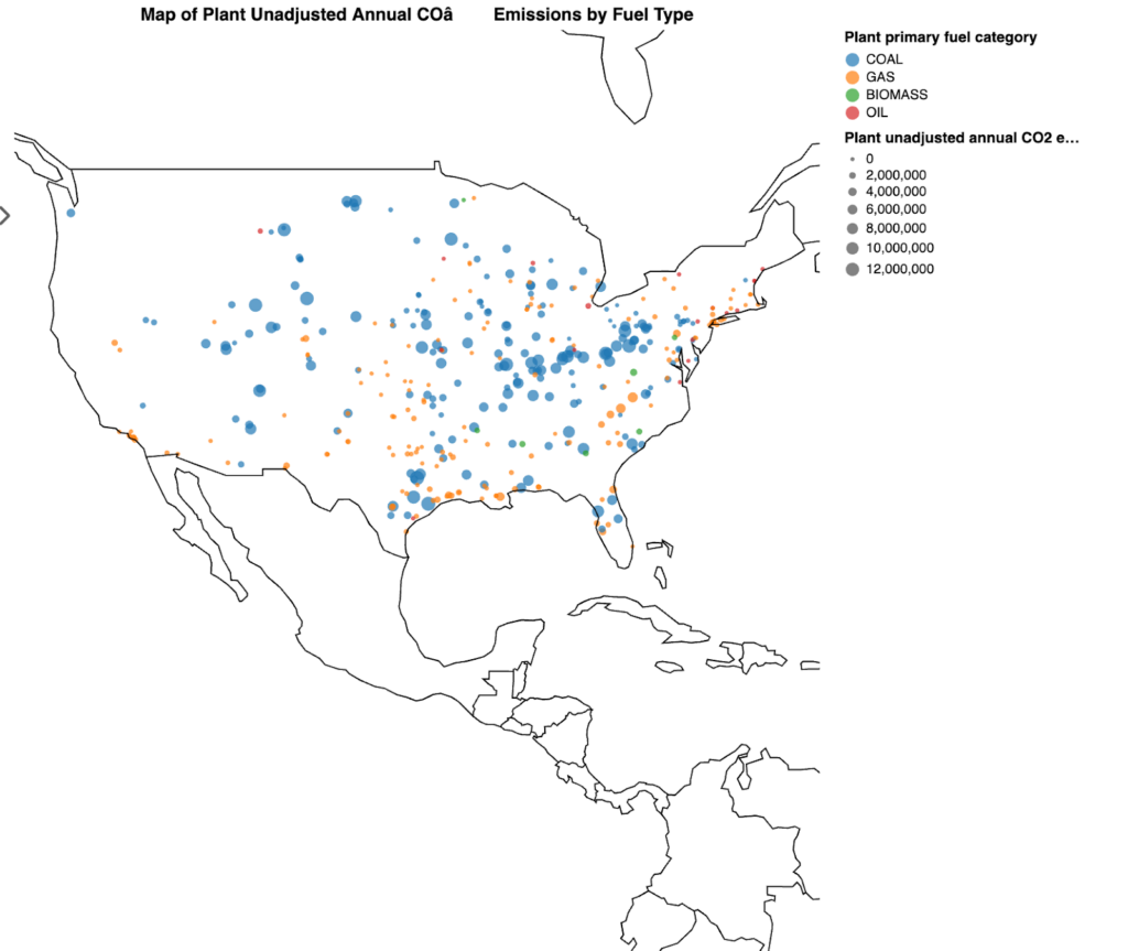
For a comprehensive view, I asked Lumen to overlay all power plants on the map and color them by fuel type. A clear pattern emerged: the eastern United States has a significantly higher density of power generation facilities compared to regions west of the Rocky Mountains. The visualization automatically color-coded the different fuel types—coal, gas, oil, and biomass—making it easy to identify regional patterns in energy production.

...

  - encoding:

      color:

        field: Plant primary fuel category

        scale:

          domain:

          - COAL

          - GAS

          - OIL

          - BIOMASS

          range:

          - '#1f77b4'

          - '#ff7f0e'

          - '#2ca02c'

          - '#d62728'

        type: nominal

      latitude:

        field: Plant latitude

        type: quantitative

      longitude:

        field: Plant longitude

        type: quantitative

      tooltip:

      - field: Plant ID

        type: quantitative

      - field: Plant primary fuel category

        type: nominal

...With the geographic distribution established, I turned my attention to the emissions data. Lumen made it easy to visualize “Plant unadjusted annual CO₂ emissions” by circle size on the map, immediately highlighting facilities with disproportionate environmental impacts.
I asked Lumen to show the top 10 states by emissions in a bar chart with an instantly generated caption for a different perspective. This visualization revealed which states contribute most significantly to power sector emissions, providing critical context for policy discussions and sustainability planning.


Taking our analysis further, I explored the “Plant annual CO₂ equivalent total output emission rate,” which normalizes greenhouse gas emissions per unit of electricity generated (lb/MWh). According to the EPA’s Emissions & Generation Resource Integrated Database (eGRID), this comprehensive metric accounts for all greenhouse gases (CO₂, CH₄, N₂O) and provides a standardized way to compare the carbon intensity of different power generation facilities. The resulting map showed which facilities produce the most emissions relative to their power output, revealing opportunities for efficiency improvements that could have significant environmental benefits.
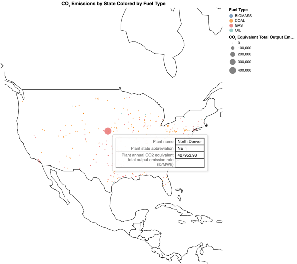


Lumen’s flexibility really shines when you extend its capabilities with custom tools. When I noticed what appeared to be an outlier in North Denver, I implemented a simple web search tool to provide additional context:
import lumen.ai as lmai

def duckduckgo_search(queries: list[str]) -> dict:

    """

    Perform a DuckDuckGo search for the provided queries.

    Parameters

    ----------

    queries : list[str]

        Search queries.

    Returns

    -------

    dict

        A dictionary mapping each query to a list of search results.

        Each search result is a dict containing 'title' and 'url'.

    """

    import requests

    from bs4 import BeautifulSoup

    results = {}

    for query in queries:

        url = f"https://duckduckgo.com/html/?q={query}"

        headers = {"User-Agent": "Mozilla/5.0"}

        response = requests.get(url, headers=headers)

        soup = BeautifulSoup(response.text, "html.parser")

        links = soup.find_all("a", {"class": "result__a"}, href=True)

        results[query] = [

            {"title": link.get_text(strip=True), "url": link["href"]} for link in links

        ]

    return results

data = ["data_centers.csv", "plant_specific_buffers.csv"]

tools = [duckduckgo_search]

lmai.ExplorerUI(data=data, tools=tools).servable()
This simple addition gave Lumen the ability to search the web and provide contextual information about points of interest in our visualizations, creating a richer, more informative exploration experience.

For users who want to take their visualizations further, Lumen supports custom visualization components. By installing DeckGL, I can create interactive 3D visualizations of our energy infrastructure data with the following:
This extensibility demonstrates how Lumen can grow with your analytical needs, from simple exploratory questions to sophisticated interactive visualizations.
import json

import yaml

import lumen.ai as lmai

import param

import panel as pn

from lumen.views.base import View

from lumen.ai.views import LumenOutput

from lumen.ai.agents import BaseViewAgent

from pydantic import BaseModel, Field

def duckduckgo_search(queries: list[str]) -> dict:

    """

    Perform a DuckDuckGo search for the provided queries.

    Parameters

    ----------

    queries : list[str]

        Search queries.

    Returns

    -------

    dict

        A dictionary mapping each query to a list of search results.

        Each search result is a dict containing 'title' and 'url'.

    """

    import requests

    from bs4 import BeautifulSoup

    results = {}

    for query in queries:

        url = f"https://duckduckgo.com/html/?q={query}"

        headers = {"User-Agent": "Mozilla/5.0"}

        response = requests.get(url, headers=headers)

        soup = BeautifulSoup(response.text, "html.parser")

        links = soup.find_all("a", {"class": "result__a"}, href=True)

        results[query] = [

            {"title": link.get_text(strip=True), "url": link["href"]} for link in links

        ]

    return results

class DeckGLView(View):

    """

    `DeckGL` provides a declarative way to render deck.gl charts.

    """

    spec = param.Dict()

    view_type = "deckgl"

    _extension = "deckgl"

    def _get_params(self) -> dict:

        df = self.get_data()

        df.columns = df.columns.str.replace(" ", "_").str.replace(

            r"[^ab-zA-Z0-9_]", "", regex=True

        )

        encoded = dict(self.spec)

        for layer in encoded["layers"]:

            layer["data"] = df

        return dict(object=encoded, **self.kwargs)

    def get_panel(self) -> pn.pane.DeckGL:

        return pn.pane.DeckGL(**self._normalize_params(self._get_params()))

class DeckGLSpec(BaseModel):

    chain_of_thought: str = Field(

        description="Explain how you will use the data to create a vegalite plot, and address any previous issues you encountered."

    )

    json_spec: str = Field(

        description="A DeckGL JSON specification based on the user input and chain of thought. Do not include description"

    )

class DeckGLAgent(BaseViewAgent):

    purpose = param.String(

        default="""

        Generates a DeckGL specification of the plot the user requested.

        If the user asks to plot DeckGL, visualize or render the data this is your best bet."""

    )

    prompts = param.Dict(

        default={

            "main": {

                "response_model": DeckGLSpec,

                "template": "deckgl_main.jinja2",

            },

        }

    )

    view_type = DeckGLView

    _extensions = ("deckgl",)

    _output_type = LumenOutput

    async def _update_spec(self, memory, event: param.parameterized.Event):

        try:

            spec = await self._extract_spec({"yaml_spec": event.new})

        except Exception:

            return

        memory["view"] = dict(spec, type=self.view_type)

    async def _extract_spec(self, spec: dict):

        if yaml_spec := spec.get("yaml_spec"):

            deckgl_spec = yaml.load(yaml_spec, Loader=yaml.SafeLoader)

        elif json_spec := spec.get("json_spec"):

            deckgl_spec = json.loads(json_spec)

        deckgl_spec["mapStyle"] = "https://basemaps.cartocdn.com/gl/dark-matter-gl-style/style.json"

        tooltips = deckgl_spec.pop("tooltip", True)

        return {

            "spec": deckgl_spec,

            "sizing_mode": "stretch_both",

            "min_height": 300,

            "max_width": 1200,

            "tooltips": tooltips,

        }

data = ["data_centers.csv", "plant_specific_buffers.csv"]

tools = [duckduckgo_search]

agents = [DeckGLAgent]

lmai.ExplorerUI(data=data, tools=tools, agents=agents, log_level="debug").servable(){% extends 'BaseViewAgent/main.jinja2' %}
{% block instructions %}
As the expert of DeckGL, generate the plot the user requested as a DeckGL specification.
Be sure radius is at least 10000 and note all column names replaced spaces with underscores,
i.e. "Plant latitude" becomes "Plant_latitude" and non-alphanumeric characters are ignored,
i.e. "Plant annual CO2 total output emission rate (lb/MWh)" becomes "Plant_annual_CO2_total_output_emission_rate_lbMWh".
If no type is requested, default to HexagonLayer.
{% endblock %}
{% block examples %}
A good example for HexagonLayer:
```json
{
"initialViewState": {
"bearing": 0,
"latitude": 37.8,
"longitude": -90.7,
"maxZoom": 15,
"minZoom": 1,
"pitch": 40.5,
"zoom": 3
},
"layers": [{
"@@type": "HexagonLayer",
"autoHighlight": true,
"coverage": 1,
"radius": 15000,
"elevationRange": [0, 10000],
"elevationScale": 50,
"extruded": true,
"getPosition": "@@=[Plant_longitude, Plant_latitude]",
"getElevationWeight": "@@=Total_Population",
"id": "hexagon-layer",
"pickable": true
}],
"mapStyle": "https://basemaps.cartocdn.com/gl/dark-matter-gl-style/style.json",
"views": [
{"@@type": "MapView", "controller": true}
]
}
```
{% endblock %}
The visualizations and analysis tools we’ve explored represent more than just interesting data points – they provide actionable insights that can inform environmental policy, business decisions, and community advocacy. Stakeholders can make better decisions about future infrastructure development by understanding where power is generated, how efficiently it’s produced, and where it’s consumed.
For example, the visualization of data centers alongside power plants might reveal co-location opportunities that could reduce transmission losses and improve overall system efficiency. Similarly, identifying regions with high emission intensities could highlight prime candidates for renewable energy investments or efficiency upgrades.
Earth Day reminds us that environmental challenges require both awareness and action. Tools like Lumen democratize data analysis, making it possible for anyone – regardless of their technical background – to derive meaningful insights from complex datasets.
As we confront climate change and work toward a more sustainable future, the ability to ask questions of our data in natural language represents a significant step forward. By removing technical barriers to exploration and insight, we empower more people to participate in the conversation about our collective environmental future.
The open-source tools developed by Anaconda and the broader Python community are creating new possibilities for citizen scientists, policy makers, and businesses to collaborate on data-driven solutions. Through the power of accessible AI and data visualization, we can transform raw information into compelling narratives that drive positive change.
This Earth Day, consider how the data at your fingertips might reveal new paths toward sustainability. What questions would you ask? What insights might you uncover? With tools like Lumen AI, the journey from curiosity to insight has never been more accessible.

