Data scientists often use SQL to interact with a data warehouse, but then often rely on Python for data discovery, visualization, and modeling. How great would it be if we can interact with a data warehouse directly with our preferred tools in Python? Snowflake now natively supports Python with Snowpark for Python. It enables us data scientists to code in Python while enjoying the same security, performance, governance, and manageability benefits Snowflake has to offer. With this tool, I can interact with my data warehouse, visualize data, and even build and deploy models back to my data warehouse directly all in Python. To understand what is in the database, one of the first steps is to visualize your data. In this article, I will show you how I create this Panel dashboard to meaningfully visualize the 5 million data points from a Snowflake dataset.

What is Snowpark for Python?
Snowpark for Python allows data scientists to write our familiar Python code and translate Python back to SQL in Snowflake. With its partnership with Anaconda, we can use all the secure and well-curated Python packages for Snowpark. Snowflake even has its own Python package repository in Anaconda: https://repo.anaconda.com/pkgs/snowflake. Snowpark for Python is still in preview. I’m not exactly sure when this will become public. But you can request access via this link.
What is Panel?
Panel builds interactive dashboards and apps. It’s like R Shiny, but more powerful. It was developed by my Anaconda colleagues Philipp Rudiger, Jean-Luc Stevens, and Jim Bednar. Panel is one of seven libraries in the HoloViz ecosystem. If you would like to learn more about HoloViz and Panel, check out my previous blog post on why I love HoloViz, panel.holoviz.org, and awesome-panel.org.
Materials
Check out my Jupyter Notebook on Github for this article.
Setup
This article uses the “OpenStreetMap — Nodes (USA)” data from the Snowflake Marketplace. This data is free to use. Find this data in the Marketplace, and click “Get Data”, then you should see it showing up in your “Data”.

Once you get access to Snowpark for Python, you can run the following in your command line to create a new Conda environment, activate this environment, install Snowpark for Python, install needed viz packages, and launch a Jupyter Notebook.
conda create --name snowflake-env python=3.8 notebook numpy -c 'https://repo.anaconda.com/pkgs/snowflake' --override-channel
conda activate snowflake-env
pip install 'snowflake_snowpark_python-0.5.0-py3-none-any.whl[pandas]'
conda install hvplot holoviews panel datashader
jupyter notebook
Now we can get started to code in our Jupyter Notebook.
Imported needed modules
First, we need to import the needed modules from Snowpark. I saved all my credentials in a separate file and imported them here, but you should use your own credentials.
# import snowpark for Python
from snowflake.snowpark import Session
from snowflake.snowpark.functions import col
# I saved all my credentials in a separate file and import them here,
# please use your own credentials
from snowflake_credentials import account, user, password, role, warehouse, database, schema
Establish a connection with Snowflake
We create a session that’s connected to our Snowflake account.
connection_parameters = {
    "account": account,
    "user": user,
    "password": password,
    "role": role,
    "warehouse": warehouse,
    "database": database,
    "schema": schema
}
session = Session.builder.configs(connection_parameters).create()
Get data
Next, we get data from the OpenStreetMap database. There are two separate tables in this database: the Data table and the Geography table. The Geography table contains the geometrics like longitude and latitude associated with the Data table. The code below shows two ways to query data from Snowflake:
- ‘session.table’ returns the content of the entire table.
- ‘session.sql’ allows us to write SQL queries and return the SQL result. The geometrics data is defined as a Geography object, which is a dictionary containing both longitude and latitude. I used st_x and st_y to extract longitude and latitude out as two separate columns.
df_data = session.table('openstreetmap.pointsofinterest_nodes_usa_latlon_v1_quarterly_v1')
df_geo = session.sql('SELECT *, st_x(GEOM) as longitude, st_y(GEOM) as latitude FROM openstreetmap.geography_usa_latlon_v1')
Data processing
There are not really many data processing steps going on here. I joined two tables using the “.join” function from Snowpark for Python. Then we can convert this Snowpark data frame to a Pandas data frame we are familiar with.
df = df_data.join(df_geo, df_data.col("geoid") == df_geo.col("geoid"))
df = df.to_pandas()
Plot 5 million data points with Datashader
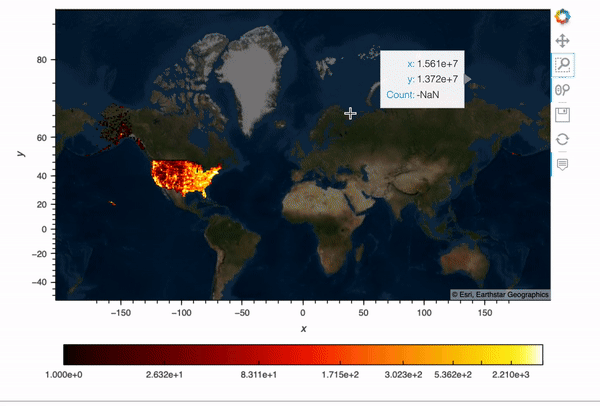
This OpenStreetMap data contains 5 million data points and I would like to plot its longitude and latitude information on a map.
Datashader is the big data visualization tool in the HoloViz family. Using Numba (just-in-time compiler) and Dask (parallel computing), Datashader plots millions and even billions of data points on a single machine really quickly. If you’d like to learn more about how Datashader works, check out my previous article on Datashader.
Okay, back to our example. First, we import the modules for plotting. We need to convert our longitude and latitude to Web Mercator coordinates so that they can show up correctly on a map. Then I wrote this function ‘datashader_plot’ to plot the 5 million data points and overlay them with a map. In this function, we first create a map ‘map_tiles’, and then use ‘hvplot’ with ‘rasterize=True’ to apply rasterization using Datashader, so that we can visualize big data quickly and meaningfully.
import holoviews as hv, pandas as pd, colorcet as cc
from holoviews.element.tiles import EsriImagery
import hvplot.pandas
from datashader.utils import lnglat_to_metersimport panel as pnhv.extension('bokeh')
# convert longitude and latitude
df.loc[:, 'x'],
df.loc[:, 'y'] = lnglat_to_meters(df.LONGITUDE, df.LATITUDE)
# plot 5 million rows and overlay with a map
map_tiles = EsriImagery().opts(alpha=0.5, width=700, height=480, bgcolor='black')plot = df.hvplot(
    'x',
    'y',
     kind='scatter',
     rasterize=True,
     cmap=cc.fire,
     cnorm='eq_hist',
     colorbar=True).opts(colorbar_position='bottom')
map_tiles * plot
The result shows an interactive plot with all 5 million data points!

Create an interactive dashboard
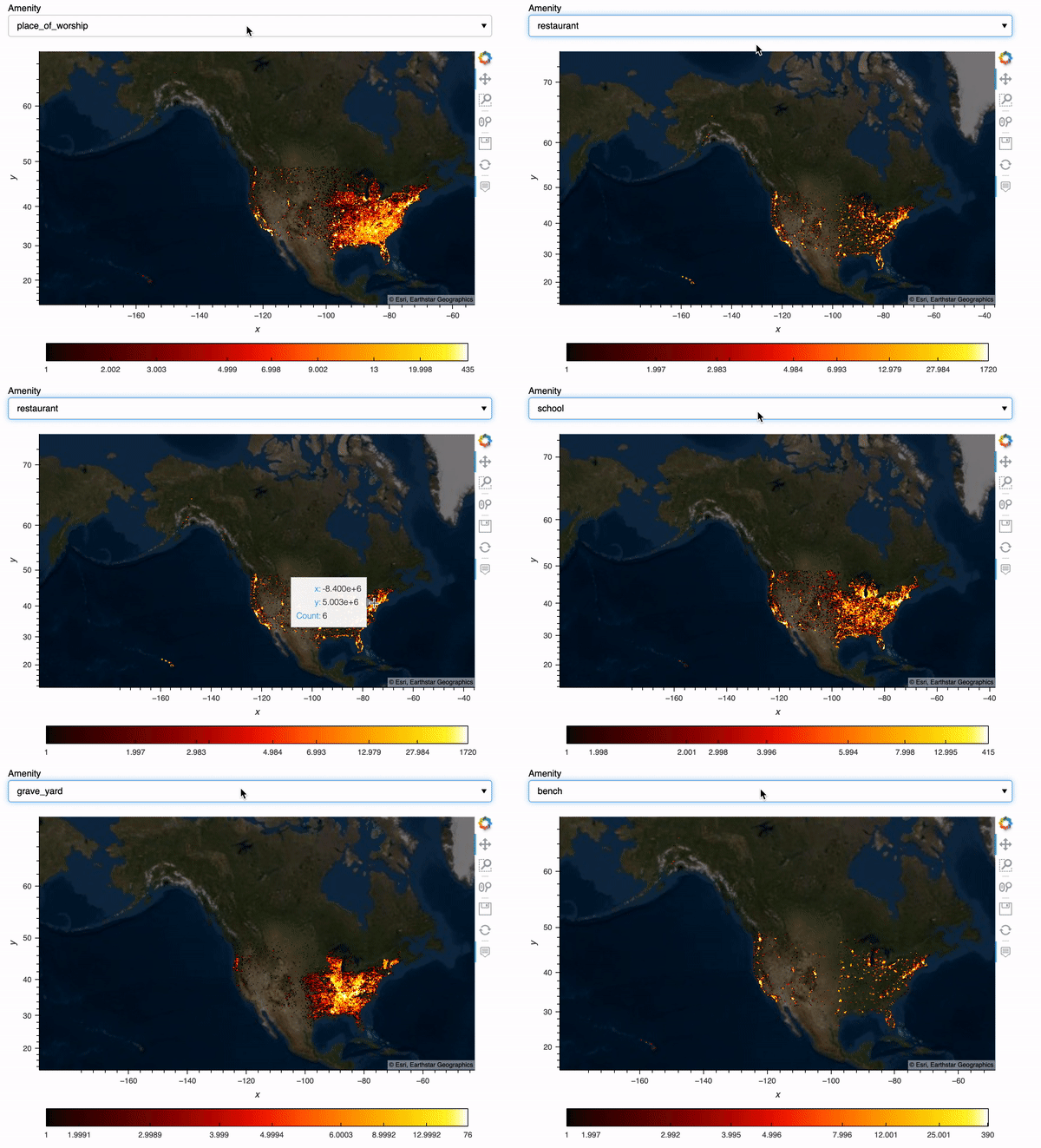
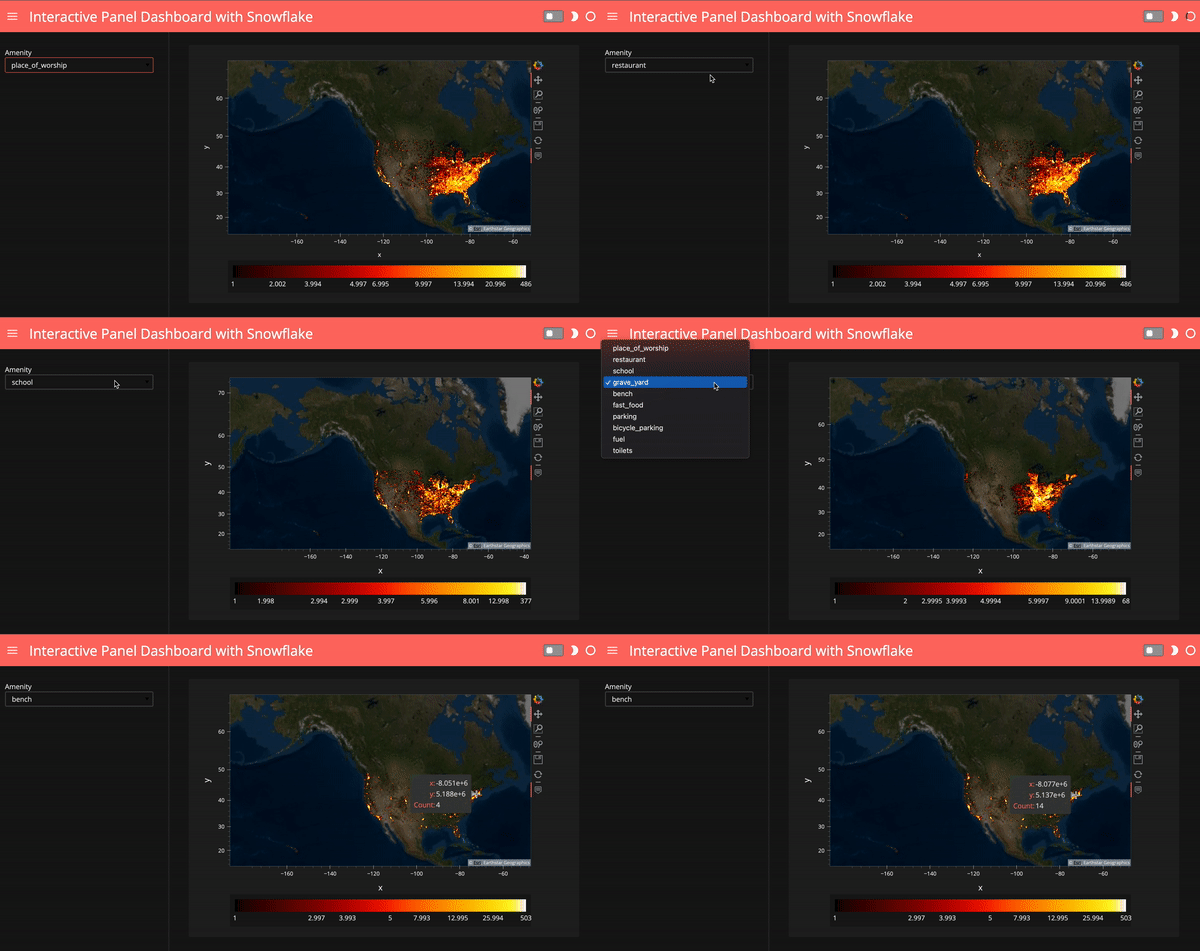
What if we’d like to select amenities and show our plots based on the amenity we choose? Here I create a Panel widget to select the top 10 amenities in the data, and then I created a Panel dashboard with the plot corresponding to the amenity we choose. I used hvPlot .iteractive to create this dashboard, for more info on hvPlot .interactive, check out my previous blog post.
# create a Panel widget to select top 10 amenities
select_amenity = pn.widgets.Select(
    options=df.AMENITY.value_counts().head(10).index.tolist(),
    name='Amenity')
# create a Panel dashboard
dfi = df.interactive
iplot = dfi[dfi.AMENITY==select_amenity].hvplot(
    'x',
    'y',
     kind='scatter',
     height=400,
     rasterize=True,
     cmap=cc.fire,
     cnorm='eq_hist',
     colorbar=True).opts(colorbar_position='bottom')
map_tiles.opts(level='underlay') * iplot 
Finally, we can use a template to make our dashboard look nicer. Running ‘template.show()’ will automatically open up with a tab showing our final dashboard.
# use a template for the Panel dashboard
template = pn.template.FastListTemplate(
    title='Interactive Panel Dashboard with Snowflake',
    sidebar=[select_amenity],
    main=[(map_tiles.opts(level='underlay') * iplot).panel()],
    accent_base_color="#ff6f69",
    header_background="#ff6f69",
    theme="dark")template.show()
# template.servable();
Deploying a dashboard
To launch this dashboard as a web server, we can uncomment the last line above ‘template.servable()’ and simply run ‘panel serve snowflake_plot.ipynb’. For detailed info on how to deploy a dashboard to a server, check out the Panel documentation, or my previous article on deploying a dashboard to Google Cloud App Engine, and Google Cloud Run.
I really enjoy using Snowpark for Python and I’m excited about its many features including Python UDFs, model building, and deployment. There is so much more I’d like to write about. Stay tuned for my next articles!
Acknowledgment
Thank you Jim Bednar for your feedback and support!
References
- https://panel.holoviz.org/
- https://datashader.org/
- https://www.snowflake.com/blog/snowflake-partners-with-and-invests-in-anaconda-to-bring-enterprise-grade-open-source-python-innovation-to-the-data-cloud/
- https://www.snowflake.com/snowpark-for-python/
About the Author
Anaconda
Sophia Yang
Sophia Yang is a Senior Data Scientist at Anaconda, Inc., where she uses data science to facilitate decision making for various departments across the company. She volunteers as a Project Incubator at NumFOCUS to help Open Source Scientific projects grow. She is also the author of multiple Python open-source libraries such as condastats, cranlogs, PyPowerUp, intake-stripe, and intake-salesforce. She holds an MS in Statistics and Ph.D. in Educational Psychology from The University of Texas at Austin.