A Comprehensive List of Python in Excel Resources
Blake Rayfield
For years, Excel has been the essential tool for operations managers and analysts, providing a powerful platform for managing data, creating reports, and handling day-to-day tasks. However, when it comes to advanced forecasting or optimization, Excel alone can sometimes fall short. Operations teams often need to rely on additional tools, such as Python or R, to perform complex analysis and modeling.
Now, with Python integrated directly into Excel, these advanced capabilities are just a formula away. This combination brings Python’s powerful data-processing and analytical tools into the familiar Excel environment, creating a seamless workflow for inventory forecasting, route optimization, and beyond. No more switching between software, exporting data back and forth, or using numerous add-ins. Python unlocks new potential within Excel, making advanced techniques accessible right in your existing spreadsheets.
In this post, we’ll dive into real-world examples that show how Python in Excel can transform inventory and supply chain management. From demand forecasting to route optimization, we’ll walk through practical ways to leverage Python’s time-series modeling and algorithmic capabilities—all within Excel. With Python’s robust libraries integrated into your spreadsheet, you can gain deeper insights, make data-driven decisions, and streamline operations.
To start using Python in Excel, simply type “=py(“. This opens an embedded Python editor in Excel, where you can apply Python functions, use libraries like Pandas and Matplotlib, and analyze data—all without leaving your spreadsheet. Whether you’re visualizing demand trends or plotting optimized delivery routes, Python in Excel makes advanced data analysis more accessible than ever.
If you’re the operations manager at a rapidly growing retail company. Each day, you juggle the demands of maintaining stock levels, meeting customer needs, and managing costs. As your product line expands and your customer base grows, predicting demand becomes critical to avoid costly stockouts or overstocking. This is where Python in Excel comes into play, bringing sophisticated demand forecasting directly into your spreadsheets.
With Python’s in excels time-series analysis capabilities, you can transform historical sales data into actionable insights, enabling smarter demand forecasting and inventory management decisions. In this example, we’ll walk through a simple demand forecasting model that uses simulated sales data to predict future demand, all within Excel.
To begin, let’s set up the data as a time series in Excel. Python makes it easy to create and manipulate dataframes, directly linked to your Excel data. Here’s how we can create a basic plot of the data in just a few lines:
#Set up your time-series data in python
df = xl("A1:B366", headers=True)
df.set_index("Date", inplace=True)

#Make a plot
df.plot()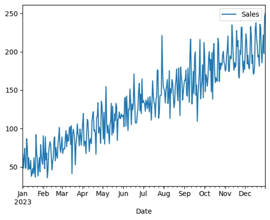
Figure 1. Simulated time-series data plotted using Python in Excel.
This initial plot gives us a quick visual of sales trends over time, providing a foundational understanding of our data. It’s a simple yet powerful step to align your inventory with customer demand. Notice we were able to create a pandas dataframe by simply selecting the data in Excel once the python editor is open.
In retail, forecasting demand accurately can be the difference between a successful season and a costly stockout. Too much stock ties up capital and increases storage costs, while too little stock risks losing customers to competitors. By predicting demand with data, we can plan inventory levels to better align with sales, optimizing supply and demand.
Using time-series forecasting models like Exponential Smoothing or ARIMA, we can predict sales patterns and anticipate upcoming demand. These models are particularly effective for capturing trends and seasonal effects in the data, which helps in creating reliable demand forecasts. Traditionally, this is not something that Excel alone could handle without the need for a third party plugin.
In this example, we can create a simple ARIMA model. In this model, we are going to allow for one AR and MA lag.
from statsmodels.tsa.arima.model import ARIMA

df.asfreq("D")

model_arima = ARIMA(df, order=(1, 1, 1), seasonal_order=(1, 1, 1, 7))

fitted_model_arima = model_arima.fit()
print(fitted_model_arima.summary())
With our model trained, we can forecast the next 90 days of sales, providing a solid basis for inventory decisions. This forecast helps determine when to reorder stock and the safety stock levels needed to prevent potential stockouts.
# Forecast for the next 90 days
forecast = fitted_model_arima.forecast(90)
forecast
To wrap it all up, we can plot the original data alongside the forecast to clearly see the projected demand trends. This visualization provides a complete picture, enabling data-driven inventory planning and helping your team make proactive decisions.
df.plot()
forecast.columns("Predicted Sales")
forecast.plot()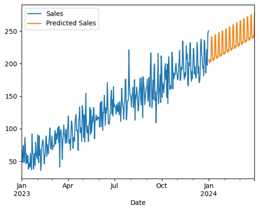
Figure 2. Time-series data plotted with forecasted data using Python in Excel.
Using Python for demand forecasting within Excel means no more shifting between multiple tools or dealing with limited add-ins. This integration allows you to leverage advanced modeling techniques to improve demand planning, reduce costs, and align inventory with anticipated sales all within a familiar Excel environment.
By taking advantage of Python in Excel, operations teams can use powerful forecasting methods in a seamless workflow, bringing data-driven decision-making right to their fingertips.
In supply chain management, efficiency is key. For companies that rely on deliveries across multiple locations, route optimization is essential. It not only saves time and reduces fuel costs but also ensures timely delivery. With Python now integrated into Excel, we have a powerful tool for tackling these complex logistical challenges without switching platforms.
In this example, we’ll look at a practical approach to route optimization using Python’s Nearest Neighbor Algorithm, a straightforward method that approximates an efficient route by visiting the closest unvisited location at each step. This technique is ideal for smaller datasets and situations where exact optimization isn’t critical. Let’s assume our distribution center delivers to 10 locations in a city, and we need to find the shortest route to cover them all.
The first step in route optimization is to calculate the distances between each location. Using Python’s numpy library, we can create a distance matrix that holds the Euclidean distance between each pair of locations. This matrix provides the foundation for the Nearest Neighbor Algorithm, helping the algorithm quickly determine the shortest path between points.
# Load location data (coordinates for each delivery location)
location_data = xl("LocationData[#All]", headers=True)
coordinates = location_data[['x', 'y']].values

# Calculate the Euclidean distance between two points
def euclidean_distance(point1, point2):
    return np.sqrt((point1[0] - point2[0]) ** 2 + (point1[1] - point2[1]) ** 2)
With our distance matrix ready, we can apply the Nearest Neighbor Algorithm. This approach starts at the initial location and iteratively visits the nearest unvisited location until all points are covered. Finally, it returns to the starting point to complete the route.
Once we’ve run the algorithm, we’ll look at the output to see the optimal sequence of stops:
| Optimal Route Calculation | ||
| Location Order | x | y |
| Location_1 | 51 | 87 |
| Location_8 | 86 | 87 |
| Location_2 | 92 | 99 |
| Location_10 | 74 | 37 |
| Location_9 | 74 | 29 |
| Location_5 | 60 | 21 |
| Location_4 | 71 | 2 |
| Location_7 | 82 | 1 |
| Location_3 | 14 | 23 |
| Location_6 | 20 | 52 |
| Location_1 | 51 | 87 |
This table provides a clear route order, minimizing backtracking and covering all delivery points efficiently.
Finally, we can plot the optimized route to get a visual representation of the delivery path. This plot helps validate the route and ensures every location is visited.
# Plot the route
plt.figure(figsize=(10, 8))
plt.scatter(location_data['x'], location_data['y'], color='blue', label='Locations')
for i in range(len(route) - 1):
    plt.plot([coordinates[route[i]][0], coordinates[route[i+1]][0]],
            [coordinates[route[i]][1], coordinates[route[i+1]][1]], 'orange')
plt.title("Optimized Delivery Route (Nearest Neighbor)")
plt.xlabel("X Coordinate")
plt.ylabel("Y Coordinate")
plt.legend()
plt.show()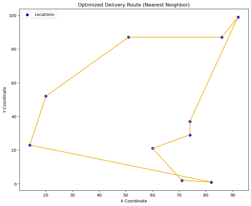
Figure 3. Optimal delivery route visualized as computed using the Nearest Neighbor algorithm using Python in Excel.
As we’ve demonstrated, optimizing a delivery route doesn’t require complex software or specialized tools. With Python’s intuitive syntax and array manipulation capabilities, made even more accessible in Excel, we easily calculated distances, implemented the Nearest Neighbor Algorithm, and generated an efficient delivery route.
Python’s flexibility and ease of use make it an ideal tool for small to medium-sized businesses looking to streamline their logistics. Using straightforward algorithms like Nearest Neighbor, you can get started on route optimization within Excel, without the need for additional software. This example shows that Python can provide quick, effective solutions to improve delivery efficiency, reduce costs, and increase customer satisfaction—all in a familiar environment.
So, if you’re looking for an accessible way to manage routes or optimize your supply chain, Python in Excel is an invaluable addition to your logistics toolkit.
Incorporating Python into Excel offers a game-changing solution for operations managers and analysts looking to elevate their data analysis capabilities without leaving the familiar Excel environment. With Python’s advanced forecasting models and optimization algorithms at your fingertips, you can tackle complex challenges like demand forecasting and route optimization with ease.
From managing stock levels to ensuring efficient delivery routes, Python in Excel transforms how you make critical decisions by providing the tools to process data, visualize insights, and predict outcomes. This powerful integration eliminates the need to toggle between multiple tools or rely on limited add-ins, streamlining workflows and enhancing productivity.
Whether you’re new to Python or a seasoned user, this integration makes it easy to apply sophisticated techniques to everyday operations tasks. With just a few lines of code, you can unlock insights that drive better planning, reduce costs, and improve service, all within the Excel spreadsheets you already know and use.
Python in Excel truly brings the best of both worlds, combining Excel’s intuitive interface with Python’s robust capabilities, making it the perfect toolkit for today’s data-driven operations. So start exploring, and see how this powerful combination can transform your approach to operations management.