This is the fifth and final in a series of blog posts that teach you to analyze data using Python code in Microsoft Excel visually.
If you are new to Python in Excel, you should start with my Python for Excel Analysts blog series, which covers many concepts that will be assumed in this blog series.
This series will use the Microsoft Excel Labs Python Editor to write code. However, the Python Editor is not required. All code can be entered using the Formula Bar and the new PY() function.
Each post in the series has an accompanying Microsoft Excel workbook to download and use to build your skills. This post’s workbook is available for download here.
For convenience, here are links to all the blog posts in this series:
- Part 1 – Using Histograms
- Part 2 – Using Box Plots
- Part 3 – Using Scatter Plots
- Part 4 – Using Bar Charts
- Part 5 – Using Line Charts (this post)
Note: To reproduce the examples in this post, install the Python in Excel trial. If you like this blog series, check out my self-paced certification program, Anaconda Certified: Data Analysis with Python in Excel.
The Analysis Scenario
This blog post will continue the hypothetical scenario covered in Part 3 and Part 4 of this series – analyzing the impact of promotion strategies.
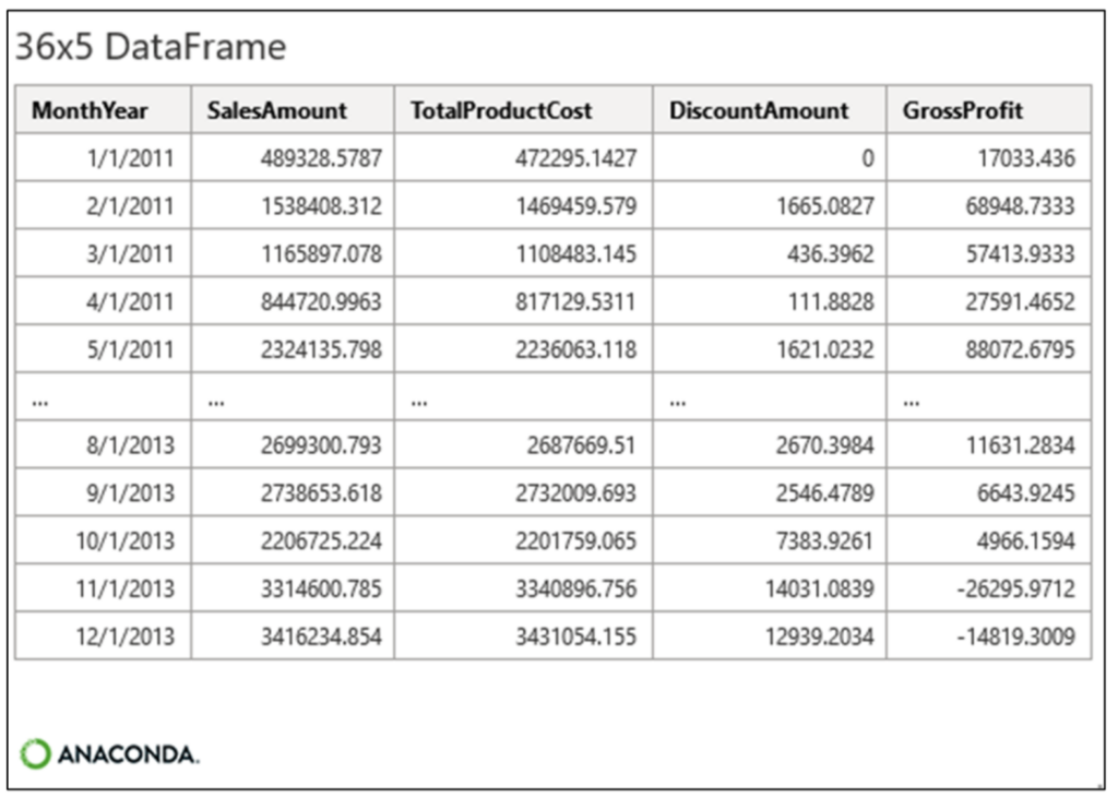
The following monthly sales data table is included in this blog post’s workbook:
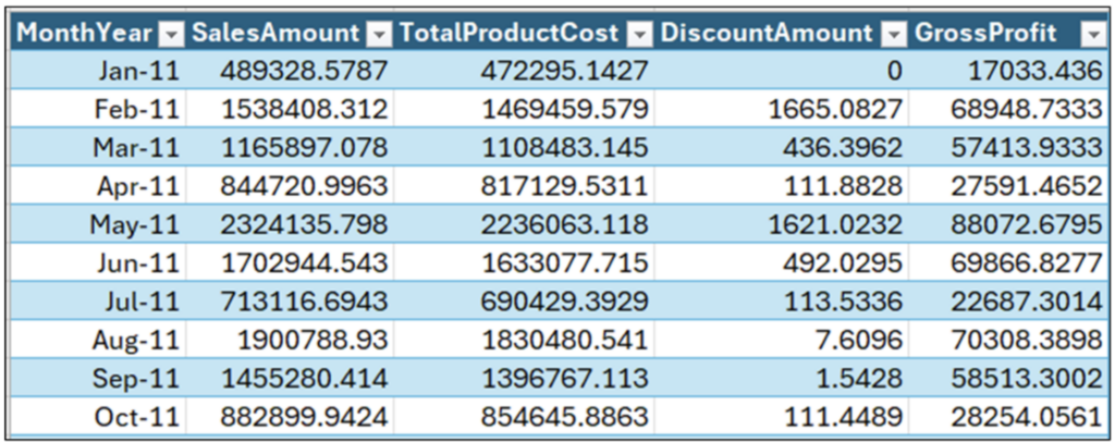
The table in Fig 01 illustrates a very common scenario in business analytics – analyzing the performance of business processes over time (i.e., time-series analysis).
The go-to visualization for time-series analysis is a line chart.
Introducing Line Charts
Time-series analysis looks at the behavior of measurements over time. When performing time-series analysis, five patterns provide you with essential insights:
- Trend – The overall tendency for a series of values to increase, decrease, or remain relatively stable during a period.
- Variability – The typical change between subsequent data points over time.
- Cycles – Patterns that repeat regularly (e.g., hourly, weekly, monthly)
- Rate of Change – The percentage difference between subsequent data points in a time series.
- Exceptions – Values that fall outside a typical range for a given time series.
The Python seaborn library makes creating line charts quite easy. Only a few lines of code are required.
To craft the seaborn line charts needed to analyze data, the Excel table shown in Fig 01 must be loaded as a pandas DataFrame:
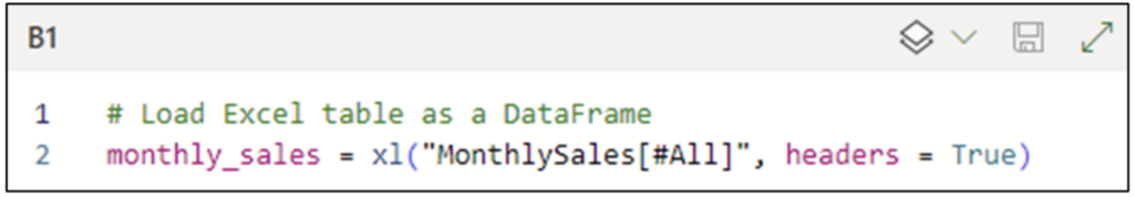
Note: While the above Python code is written using the Excel Labs Python Editor, this is not required.
Clicking the disk icon tells the Python Code Editor to execute the Python code:
Your First Line Chart
A logical place to start the analysis is to understand SalesAmounts over time. The following Python code uses the seaborn library to create a line chart:
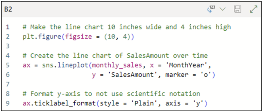
Here’s the explanation of the code shown in Fig 04:
- As line charts are wider than they are tall, line 2 of the code leverages the figure() function of the pyplot library to set the size of the line chart to 10 x 4 inches.
- The seaborn lineplot() function is used on line 5 to create the line chart. The line chart is configured as follows:
- The monthly_sales DataFrame is used as the data source.
- The x-axis is configured to use the MonthYear column.
- The y-axis is configured to use the SalesAmount column.
- The marker parameter is set to add points for each SalesAmount value on the line chart.
- By default, seaborn will use scientific notation for large values. Line 9 of the code uses the ticklabel_format() function to force plain numbers to be used in the chart.
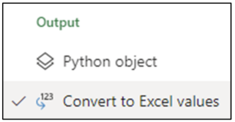
Configuring the code cell with the Convert to Excel values option will render the line chart directly in the worksheet cell:
Clicking the disk icon in the Python Code Editor executes the code and produces the following line chart:
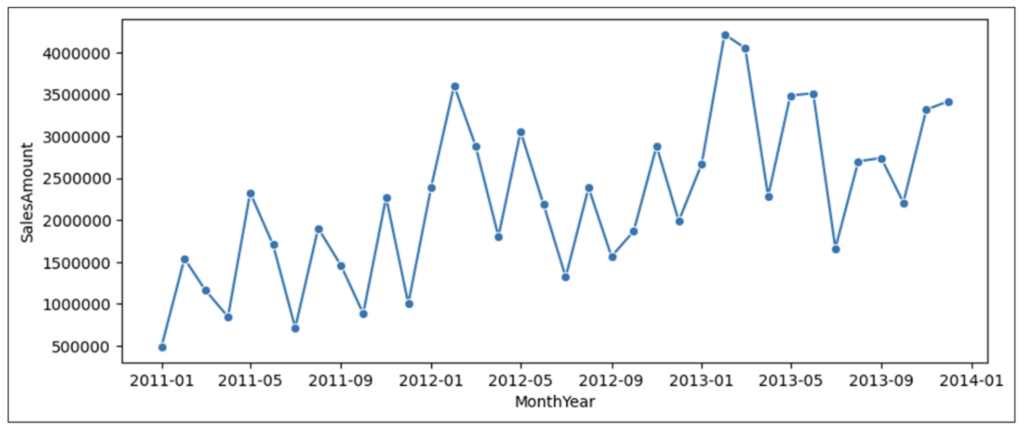
Let us apply the five aforementioned patterns of time-series analysis to Fig 06:
- Trend – Overall, sales have been trending upward during the three-year period.
- Variability – Quite a bit of variability is exhibited in the time series (i.e., many ups and downs).
- Cycles – One cycle present in the data indicates a drop in 2011 and 2012 December, with a subsequent jump in January.
- Rate of Change – The percentage difference between the data points varies quite a bit, where the variability exhibits large swings in sales.
- Exceptions – Looking at the data, it’s possible that the sales for February/March 2013 are exceptionally high values.
Note: Regarding the potentially exceptional values in a time series, process behavior charts offer a robust way to determine if any values in a time series are truly exceptional based on historical performance.
Discount Amounts Over Time
The DiscountAmount column of monthly_sales represents the aggregate promotional discounts given during a month. The following code creates a line chart of DiscountAmounts:
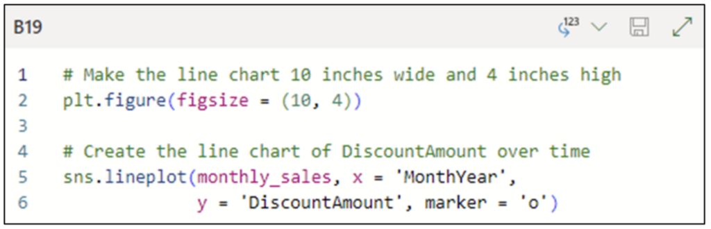
Executing the code cell shown in Fig 07 with the Convert to Excel values option produces the following line chart:
Once again, let us apply the five patterns of time-series analysis to Fig 08:
- Trend – Overall, there is no strong trend in discounts during the three-year period.
- Variability – There are a few areas of extreme variability (e.g., the two high spikes) in the time series.
- Cycles – There are no discernible cycles in the time series.
- Rate of Change – Other than the two spikes, the overall rate of change is small.
- Exceptions – There are four exceptional data points corresponding to December 2012 and the first three months of 2013.
Analyzing the line chart shown in Fig 08 provides a powerful piece of information regarding the behavior of promotions over time. Namely, there doesn’t appear to be a consistent promotion strategy during the three-year period depicted in Fig 08.
Multiple Time-Series Analysis
As evident from the line charts above, time-series analysis is a very useful technique, but there is more that can be done with line charts!
Visualizing multiple time series on the same chart can often lead to recognizing layered patterns in data. Luckily, using pandas, it is trivial to create multi-series line charts.
Preparing the Data
The first step is to transform the existing monthly_sales DataFrame from a “wide” format to a “long” format. A wide format is when a column exists for each time series, as the card for monthly_sales demonstrates:
A data frame in the long format has the following three columns:
- A column of the date values shared across all the time series (e.g., the MonthYear column in Fig 09).
- A column containing values denoting which time series the row belongs to (e.g., ‘SalesAmount’ vs. ‘TotalProductCost’).
- A column containing the time-series values (e.g., 17033.436).
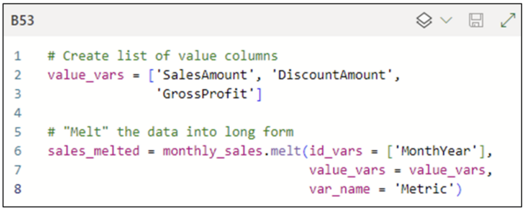
The easiest way to transform a DataFrame from wide to long format is using the DataFrame melt() method. The following code creates a sales_melted DataFrame from monthly_sales:
Note: The code cell depicted in Fig 10 is executed with the Python object output option.
Here’s the explanation of the code shown in Fig 10:
- Line 2 creates a Python list of the column names of the time-series values to be melted (e.g., the TotalProductCost column is not included).
- Line 6 creates the sales_melted DataFrame via calling melt() on monthly_sales:
- The id_vars parameter specifies that the MonthYear column should be used to provide the dates shared by all the time series.
- The value_vars parameter specifies which times-series columns should be melted.
- The var_name parameter specifies a custom name for the column that will hold the time-series names.
After the code in Fig 10 is executed, looking at the sales_melted card in Excel makes the above code clear:
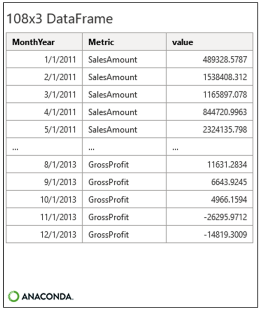
When looking at Fig 11, notice how there are 108 rows in the sales_melted DataFrame. Compare this to the monthly_sales DataFrame depicted in Fig 09 with 36 rows.
The difference in row count is due to sales_melted having 3 times series each with 36 values; 3 times 36 equals 108.
With the sales_melted DataFrame created, it’s time to plot the line chart.
Multi-Series Line Chart
The following code creates a multi-series line chart:
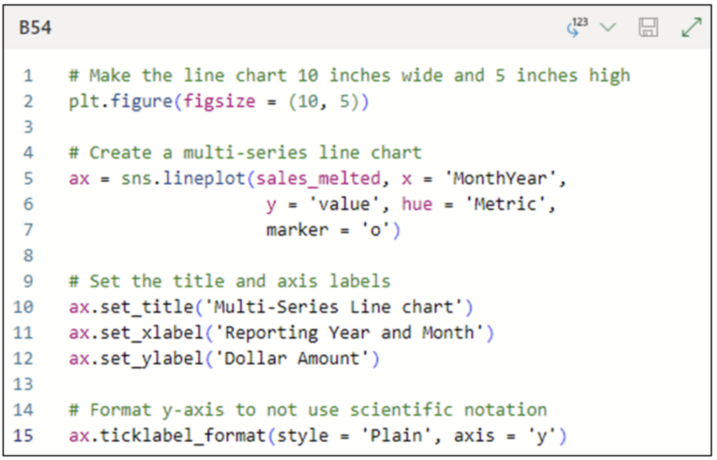
While the code shown in Fig 12 resembles previous code, there are some items to note:
- Line 5 uses the sales_melted DataFrame as the data source and configures the line chart thusly:
- The y-axis is mapped to the value column created by the call to melt().
- The hue parameter is mapped to the Metric column created by the call to melt(). This will create a line in the chart for each unique value of Metric.
- Lines 10, 11, and 12 set the title and axis labels of the line chart to custom values via the set_title(), set_xlabel(), and set_ylabel() functions.
Executing the code cell with the Convert to Excel values option produces the following line chart:
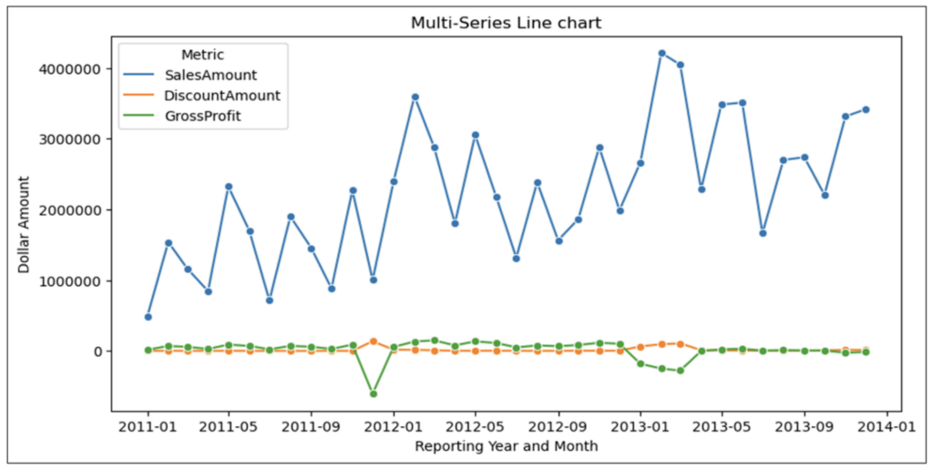
In addition to applying the five time-series patterns to Fig 13, examining the chart reveals the following:
- Interestingly, while SalesAmount shows an upward trend, GrossProfit appears to be relatively flat.
- The chart clearly shows that in months where DiscountAmounts are high, GrossProfit is negative. This is a highly interesting association that requires additional analysis to understand if discounts are causing losses.
- Overall, sales appear to be independent of any promotional strategy.
- The high SalesAmounts of February/March 2013 are associated with a time where DiscountAmounts were also high. Again, this association would require additional analysis to understand the drivers of the numbers.
Line charts like the one depicted in Fig 13 are often the early warning system in business analytics.
For example, line charts are common visualizations used in executive dashboards. A common scenario is for leaders to see something “bad” in a line chart and request that an analysis be conducted to explain what is being observed.
The analysis techniques covered in this blog series are commonly used to craft these explanations.
What’s Next?
This post has demonstrated how line charts provide one of the most fundamental skills in business analytics – recognizing patterns in business metrics over time.
Line charts are particularly effective in analyzing key performance indicators (KPIs). If you want to have more impact using data with leaders, KPI analysis is a powerful tool in your toolbelt.
If you are interested in learning more about visualizing data using the seaborn library, be sure to check out “An introduction to seaborn.”
Until next time, stay healthy and happy data sleuthing!