The travel industry is constantly changing, shaped by new technology, economic shifts, and global events. Tools like Google Flights, shifts in passenger demand, and fare changes all tell a story of how the industry adapts.
In this analysis, we explore holiday air travel trends. Using data from public sources and tools like Panel, hvPlot, and Anaconda Notebooks, we developed visualizations like curves, bar charts, heatmaps, and boxplots to measure search interest, passenger numbers, flight schedules, airport activity, and fare changes between cities. Together, these pieces show how the industry handles the busy holiday season.
This isn’t just about travel—it’s about finding patterns and making sense of big changes. By looking closely at the data, we can see how decisions are made and how trends unfold, offering insights that go far beyond holiday travel.
Here are the sources we used:
- “Google flights” popularity: Google Trends
- Aviation Data on transportation.gov
- Bureau of Transportation Statistics
Here is the code: flights.ipynb on Anaconda Notebooks
Trending: Google Flights Growth Over Time
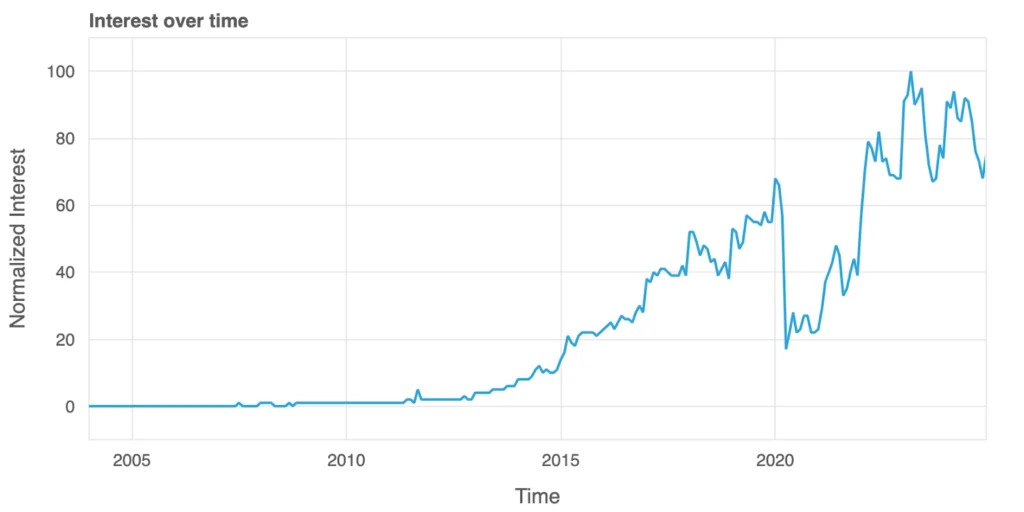
Since 2011, Google Flights has become a go-to tool for travel planning, and its search trends tell an interesting story. Before its launch, search interest was nearly nonexistent. Over the years, as more people discovered the convenience of planning trips online, searches for “Google Flights” steadily grew throughout the 2010s.
The graph shows a sharp drop in 2020 when the COVID-19 pandemic brought global travel to a halt. But the recovery afterward has been remarkable. As airlines rebounded, people embraced new digital tools and felt a renewed sense of wanderlust after being cooped up for so long. Google Flights’ growing popularity reflects how travelers are navigating the post-pandemic world, eager to explore and equipped with better ways to plan their journeys.
Passengers: Rising Numbers and Post-Pandemic Shifts
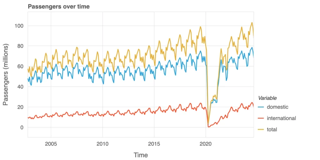
Previously, that was interest in purchasing tickets, but how many people actually took to the skies? This graph shows domestic (blue), international (red), and total (yellow) air passenger numbers over time, highlighting actual travel. Domestic travel grew steadily with predictable seasonal dips, while international travel rose more gradually. Both trends were upended in 2020 when the COVID-19 pandemic grounded planes worldwide. The recovery since then shows a gradual return to pre-pandemic levels, and later even exceeding pre-pandemic levels.
Flights: Reflecting Passenger Trends
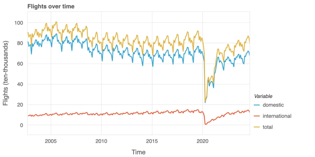
Flight volumes have traditionally reflected passenger demand. Domestic operations (blue) have long prevailed, mirroring seasonal travel patterns, while international services (red) maintain a smaller but consistent portion of the market. Overall activity (yellow) plunged in 2020, illustrating the abrupt halt in global travel. As post-pandemic demand recovers, the data suggests airlines are adjusting their schedules to better align with changing traveler needs. Some capacity challenges persist, however, because the sudden drop in global travel demand wiped out a significant share of airlines’ revenue streams. With ongoing fixed costs—such as aircraft leases, maintenance, and staffing—continuing to strain their finances, certain carriers found themselves unable to remain solvent. This prolonged revenue shortfall forced some airlines to file for bankruptcy protection or pursue restructuring just to survive.
Passengers vs. Flights: A Changing Balance
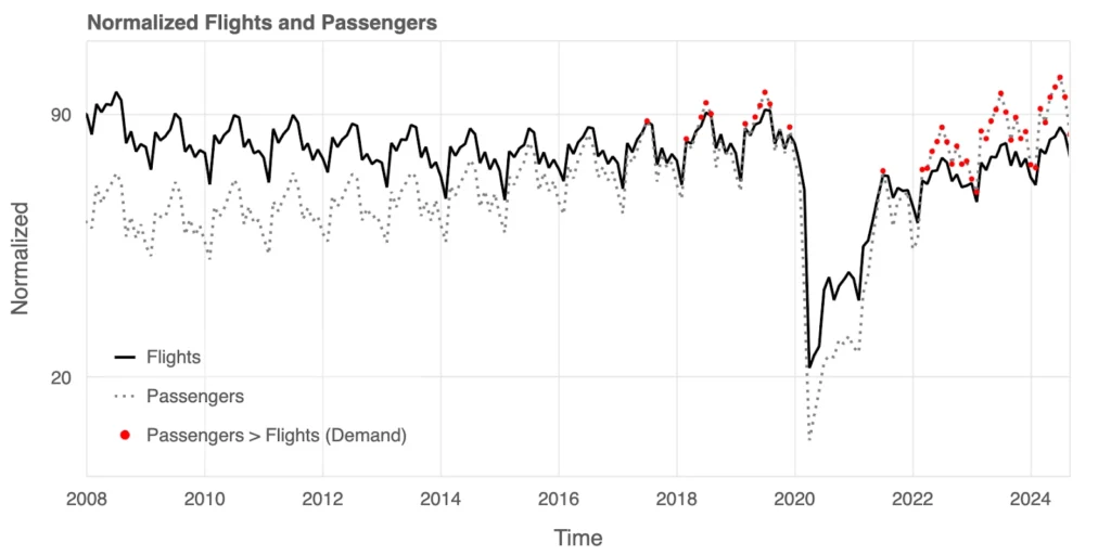
A combined look at flights (solid line) and passengers (dotted line) reveals a key trend in supply and demand. Before 2016, flights often outpaced passengers, reflecting excess capacity. But starting in 2016, passenger demand began to exceed flight availability, marked by red dots on the graph. This trend persisted until the pandemic disrupted travel in 2020. Post-pandemic, demand has again outpaced supply in certain periods, showcasing the challenges airlines face in scaling operations to meet shifting travel patterns and growing passenger expectations.
Passengers vs. Flights: International Edition
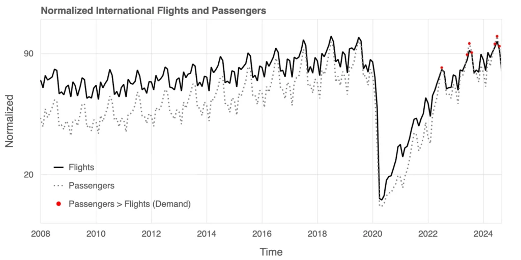
For international flights, the gap between supply and demand has only recently shifted. Until 2016, there was consistent overcapacity, with flights (solid line) exceeding passengers (dotted line). But rising interest in international travel reversed this trend, with passenger demand outpacing flight availability. The pandemic caused a steep decline in both metrics, but recovery data highlights repeated periods where demand exceeded supply. Airlines are now navigating how to scale operations and meet this heightened interest in international travel.
Passengers vs. Flights Monthly View: Growing Demand
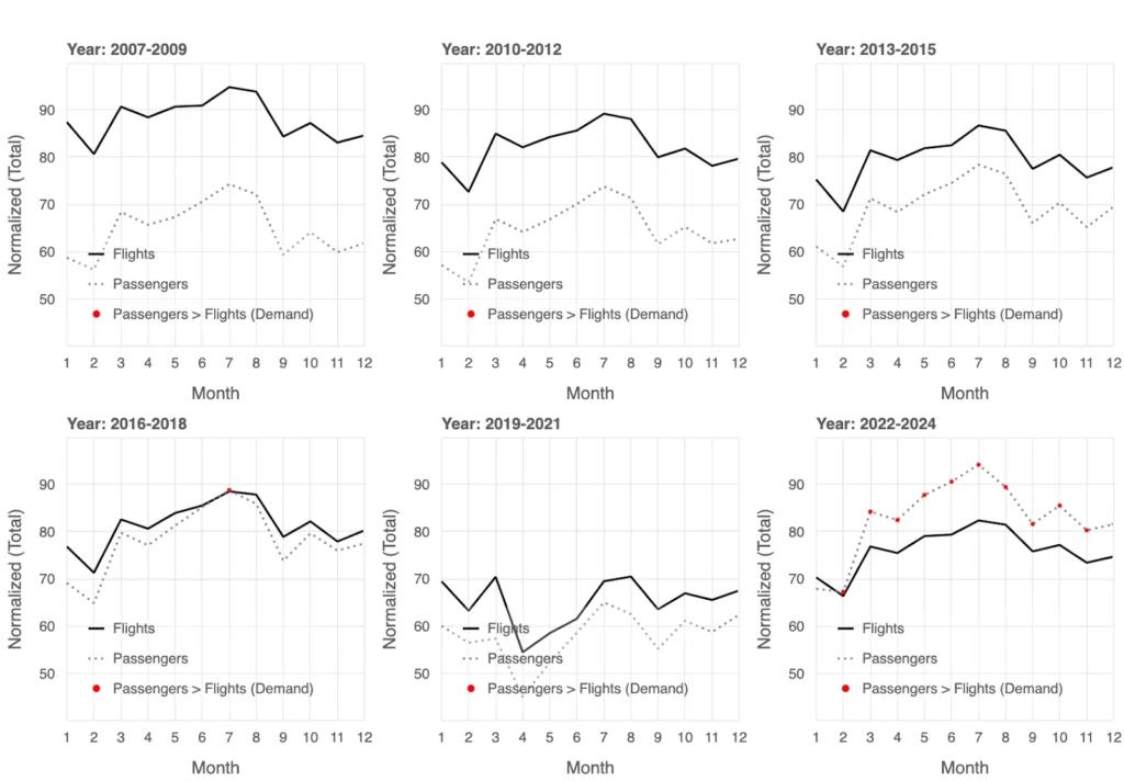
The monthly averages of total flights and passengers reveal notable trends in supply and demand over time. From 2007 to 2015, flights (solid line) consistently exceeded passengers (dotted line), with overcapacity particularly evident during the early part of the year, such as January and February. These months consistently show lower passenger demand, suggesting they might be the best time for cost-conscious travelers to find better availability and potentially lower fares. Starting in 2016, demand began to outpace supply during peak months, especially in the summer, as indicated by the red markers. The pandemic in 2020 caused a sharp drop in both metrics, but the recovery from 2022 onward highlights repeated demand surges exceeding flight capacity, particularly during summer months, reflecting heightened travel interest. This seasonal pattern provides valuable insights for travelers looking to plan trips during off-peak periods for better options and savings.
Passengers vs. Flights Monthly View: International Edition
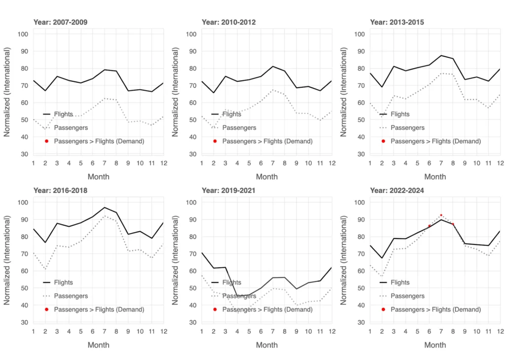
The monthly averages for international flights and passengers highlight shifting dynamics in supply and demand over time. From 2007 to 2015, flights (solid line) consistently exceeded passenger numbers (dotted line), reflecting overcapacity, particularly during off-peak months like January and February, which may offer travelers better availability and lower fares. By 2016, demand began to outpace supply during peak travel months (red markers), signaling increased interest in international travel. This trend persisted until the COVID-19 pandemic caused a sharp decline in both metrics, disrupting the balance. In the recovery years of 2022 through 2024, demand frequently exceeded flight supply during summer months, underscoring the seasonal nature of international travel, when students are off on their summer breaks.
Airports for International Departures: Key Hubs
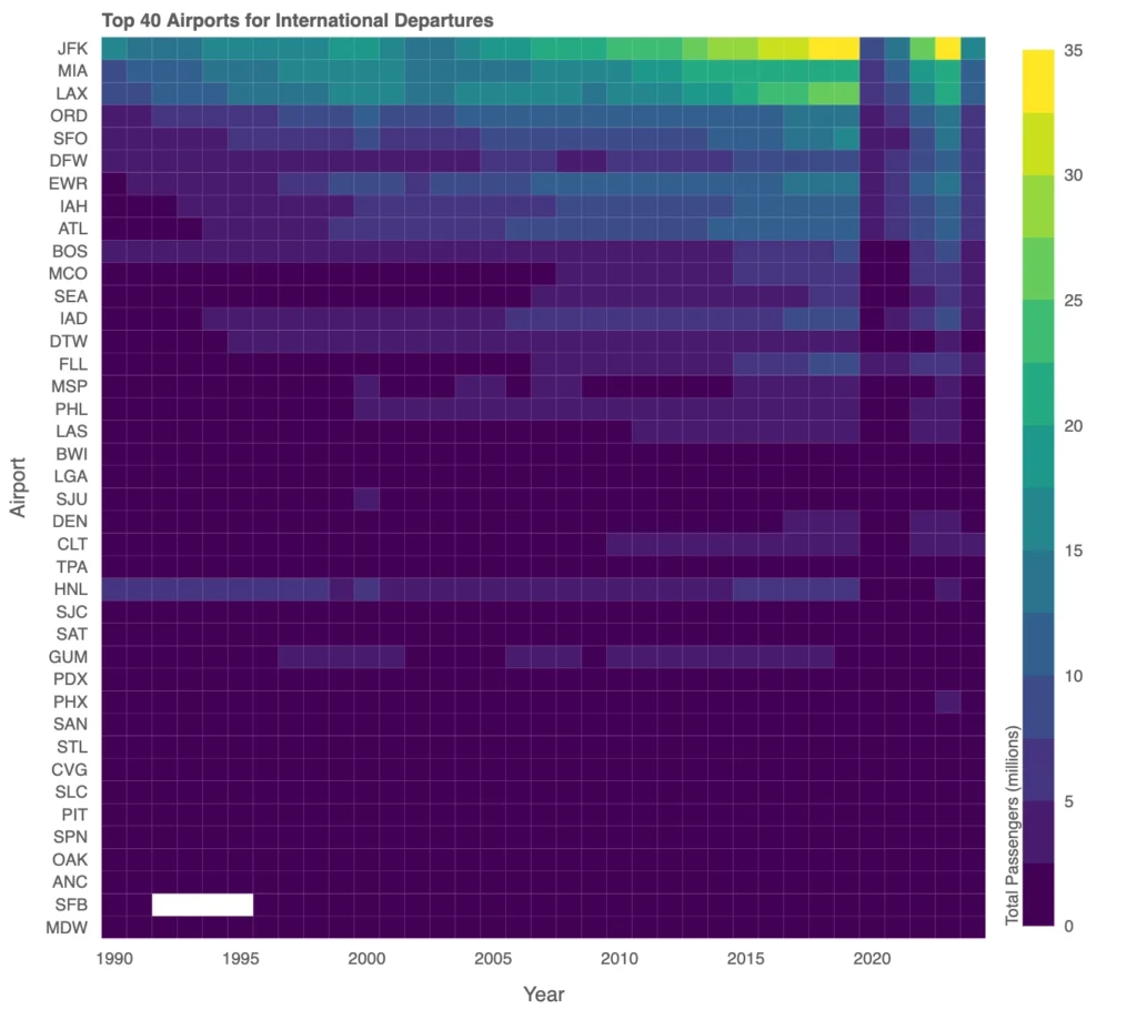
A heatmap of international passenger traffic reveals that a handful of airports, such as JFK, LAX, and MIA, handle the majority of international travel. Notable shifts, however, include the decline of Honolulu International Airport (HNL). Once a key hub, HNL has seen reduced prominence due to evolving airline strategies that favor mainland airports like LAX and SFO, along with advancements in long-haul aircraft that bypass HNL entirely. Economic shifts, changing tourism markets, and pandemic-related route adjustments have further impacted HNL’s role, illustrating the dynamic nature of U.S. international air traffic.
Airports for International Arrivals from 2022: Key Hubs
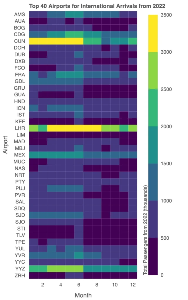
The heatmap highlights the top 40 international arrival airports from the U.S. in 2022, revealing distinct seasonal trends and traffic patterns across different regions.
London Heathrow (LHR) stands out with a pronounced summer peak, reflecting heightened travel demand to Europe during the tourist-heavy months of June through August. Traffic to LHR dips significantly in January and February, aligning with lower transatlantic travel during winter. Similarly, other European hubs like Charles de Gaulle (CDG) and Frankfurt (FRA) exhibit strong summer spikes, underscoring the influence of seasonal tourism on these routes.
In contrast, Cancun (CUN) maintains consistently high traffic throughout the year, with slightly elevated volumes during the winter and spring months, likely driven by U.S. travelers seeking warm-weather destinations. Middle Eastern hubs like Dubai (DXB) and Doha (DOH) exhibit steady traffic across all months, emphasizing their roles as year-round global transit hubs rather than purely destination airports.
Substantial Fare Increases
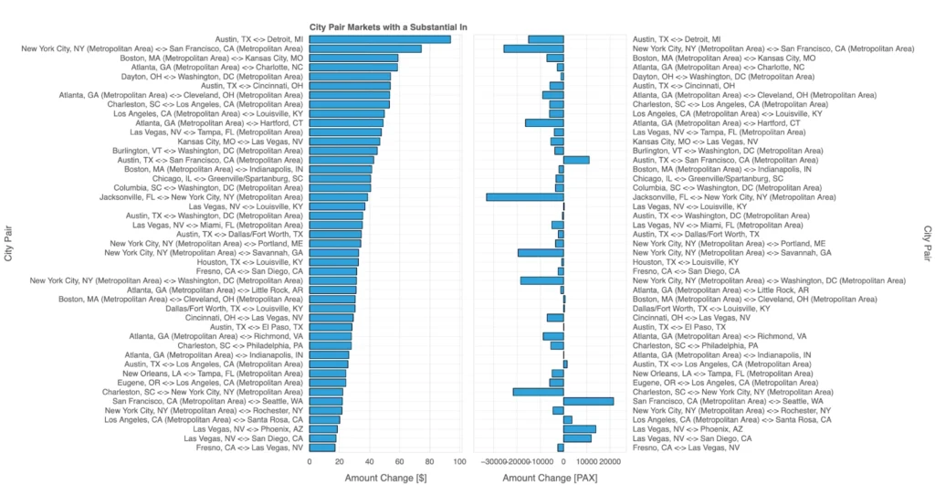
This visualization highlights significant fare increases and changes in passenger numbers (PAX) across key city-pair markets in 2024 Q3. The left panel showcases routes with the largest fare increases, measured in dollars. Notable examples include Austin, TX ↔ Detroit, MI and New York City ↔ San Francisco, where fares have risen significantly, potentially due to reduced competition or strategic pricing adjustments by airlines.
The right panel examines changes in passenger traffic for these same routes, revealing an interesting relationship: when passenger numbers decline, fares often continue to rise. For instance, routes like Las Vegas ↔ Louisville show substantial passenger decreases alongside fare increases, suggesting that airlines are offsetting lower demand by raising prices to maintain profitability.
These trends highlight how airlines navigate the balance between demand and revenue. While some routes sustain or grow passenger volumes despite higher fares, others experience declining traffic paired with fare increases, reflecting pricing strategies that respond to evolving market conditions rather than pure demand growth.
Explore this map yourself in an Anaconda Notebook.
Evolution of Average Fare Increases
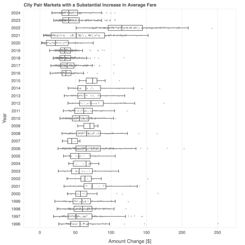
This box plot illustrates the evolution of average fares in city-pair markets with substantial increases over time, revealing key trends in pricing.
Early years, such as the mid-2000s, exhibit lower median fares with relatively compact interquartile ranges, suggesting more stable and competitive pricing.
From 2010 onward, fare variability increases, as evidenced by the wider spread of data points and longer whiskers, indicating a divergence in pricing across markets.
Post-2020, the impact of the COVID-19 pandemic becomes evident, with 2021 and subsequent years showing significantly higher fares and greater dispersion. This reflects airlines’ efforts to recover revenue amid constrained operations and fluctuating demand. By 2024, the box plot highlights persistently elevated fares, suggesting a lasting shift in pricing dynamics driven by changes in market conditions and operational strategies.
Substantial Fare Decrease
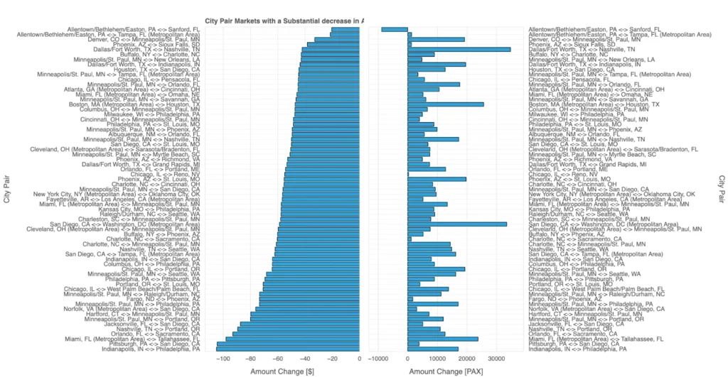
This visualization explores city-pair markets in 2024 Q3 with substantial decreases in average fares and their corresponding changes in passenger numbers (PAX). The left panel highlights routes with the largest fare reductions, while the right panel tracks changes in passenger volumes for the same routes.
A notable pattern emerges: fare decreases often coincide with increased passenger traffic, suggesting that lower prices made these routes more accessible and attractive to travelers. For instance, routes like Allentown ↔ Sanford and Denver ↔ Minneapolis show significant fare reductions accompanied by a rise in passengers, likely due to travelers taking advantage of cheaper options.
However, some routes with reduced fares still exhibit declining passenger numbers, pointing to alternative factors at play. These could include reduced connectivity, market competition, or shifts in travel preferences. Conversely, routes with rising passenger counts may reflect broader demand-driven growth as fares became more competitive.
This dual dynamic underscores the interplay between pricing strategies and traveler behavior: fare reductions can stimulate demand in many cases, but external factors and alternative travel choices also play a critical role in shaping traffic trends.
Evolution of Average Fare Decreases
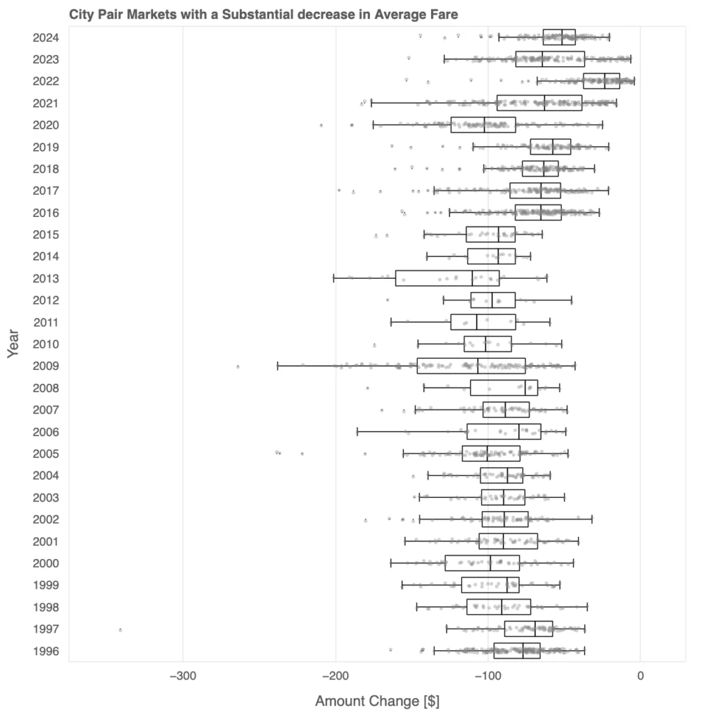
This box plot depicts the evolution of substantial decreases in average fares across city-pair markets over time. Early years, such as the late 1990s and early 2000s, show relatively smaller fare reductions, as reflected in the narrower interquartile ranges and fewer outliers. This suggests a period of more uniform pricing and limited fare cuts.
Starting in the mid-2000s, the magnitude of fare reductions increases, with medians shifting further to the left and the interquartile ranges widening. The presence of extreme outliers, especially post-2010, highlights significant fare cuts on specific routes. This period aligns with intensified competition among airlines, the rise of low-cost carriers, and evolving pricing strategies.
By the 2020s, the pattern stabilizes somewhat, but substantial fare decreases remain prevalent. The persistence of large reductions, even during years of recovery post-COVID-19, suggests that airlines continued to use aggressive pricing to attract passengers in specific markets, especially amid shifting travel behaviors and operational constraints. Overall, the plot reveals how fare reductions have become an integral part of airline strategies to adapt to changing market dynamics.
Unlock Insights with Anaconda
This analysis of holiday air travel trends highlights how data science can uncover meaningful patterns in complex, dynamic industries like travel. By leveraging open-source tools such as Panel, hvPlot, and Anaconda Notebooks, we explored everything from digital search trends to passenger volumes and fare strategies, demonstrating the power of accessible, scalable technology in transforming raw data into actionable insights.
Projects like this aren’t just valuable for understanding the travel industry—they showcase the kind of data-driven approaches organizations can use to stay informed and competitive in any market. Open-source software is at the heart of this innovation, enabling data professionals to tackle problems with flexibility and precision. Anaconda plays a vital role in this ecosystem, providing the tools and resources to empower users at all skill levels.
Ready to see more in action? Check out our blog post analyzing 2024 U.S. election data to discover additional ways to apply open-source tools for impactful insights. Whether you’re navigating business challenges or exploring emerging trends, Anaconda helps make it possible.

