A Time Series Primer
If you want to predict trends in temporal data, time is an important factor that must be considered in many types of analyses. Classic examples of this kind of analysis can be found in many domains. For example, in finance time series analysis can be used by stock trades to get a better understanding of various stock prices. Similarly in healthcare, temporal data (generally also referred to as longitudinal data) are used to denote the health trajectories of patients, with the intention to predict disease or recovery progression. Another example of time series analysis can be found in meteorology, where temporal data are used in many use cases like temperature forecasting or air quality control. In this blog post, we will consider an example of air pollution forecasting, exploring how the new integration of Python would allow for unprecedented time series analysis features in Excel. In simple terms, a time series can be defined as a series of data points, ordered in time. Most commonly, a time series comprises a sequence of successive equally spaced points in time (e.g., every 5 minutes, or every hour), so that in essence what we normally deal with are discrete temporal data sequences. In a time series, time is the independent variable, and the goal of the data analysis is usually to make a forecast for the future. However, there are other important aspects that should be considered whenever we work with temporal data: (1) autocorrelation, (2) seasonality, (3) stationariness. Informally, autocorrelation is how similar multiple observations are over a certain period of time (i.e., the time lag). On the other hand, seasonality tries to capture the concept of periodic fluctuations in the data. For example, “prices of goods are higher during holiday seasons.” A time series is referred to as stationary if its statistical properties do not change over time. In other words, it has constant mean and variance, and its covariance is independent of time. There are many ways to model a time series in order to make predictions. The most popular methods are: Moving Average, Exponential smoothing, and ARIMA. In this post, we will consider the latter in our experiments, as it is one of the most powerful ones that also better demonstrates the new capabilities introduced by Python in Excel. If you are interested in knowing more about time series modeling in Python, I recommend checking out the GitHub repository by Francesca Mazzeri, Machine Learning at Microsoft, with examples using Anaconda Distribution and Azure Cloud. Intuitively, ARIMA (AutoRegressive Integrated Moving Average) is defined as a model resulting from the combination of three simpler models, designed to work on univariate time series exhibiting non-stationary properties. It combines AutoRegression (AR) and Moving Average (MA) models, along with a differencing pre-processing step of the sequence to make the sequence stationary, called integration (I). More information on ARIMA models can be found in the corresponding Wikipedia article.Forecasting Air Pollution with Python in Excel
First, let’s download the Excel workbook containing the air_pollution.xlsx data. In this example, we will consider a dataset containing (daily) data about air pollution. Each entry in the dataset is characterized by its date, the level of pollution on the current day, the day before, along with other info about weather conditions on the day (e.g., if any rain, wind, snow, pressure, and the temperature).Dataset Info
The first thing we are going to do is to describe our data, by loading the Excel table into a pandas.DataFrame using Python in Excel. In this way, we will also get our bearings with the new integration. Let’s create a new worksheet, and name it Data Info. Let’s now convert the A1 cell into a Python cell. We can do that using =PY or using the keyboard shortcut Ctrl + Shift + Alt + P. In the formula editor, let’s write the following few lines of Python to convert the Excel table in a pandas data frame:import pandas as pd
air_pollution = xl("Table1[#All]", headers=True)
air_pollution["date"] = pd.to_datetime(air_pollution["date"])
air_pollution.set_index("date", inplace=True)
air_pollution.describe()from matplotlib import pyplot as plt
plt.style.use('bmh') # set the plotting style
values = air_pollution.values
def plot_data_trends(column_name):
fig = plt.figure()
idx = air_pollution.columns.to_list().index(column_name)
plt.plot(values[:, idx])
plt.title(column_name, y=1, loc="right")
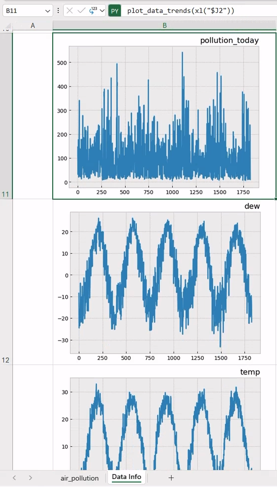
return figair_pollution.columnsplot_data_trends(xl("$J2"))This will generate the data trend for the first column. Now, let’s drag the cell content over the following 6 consecutive rows, have Excel do its magic by automatically updating the reference to the column name, and generate the corresponding plot! Once done, adjust the row height, and column width accordingly to fit the visualization of the plots within the cells (e.g., Row Height = 250).
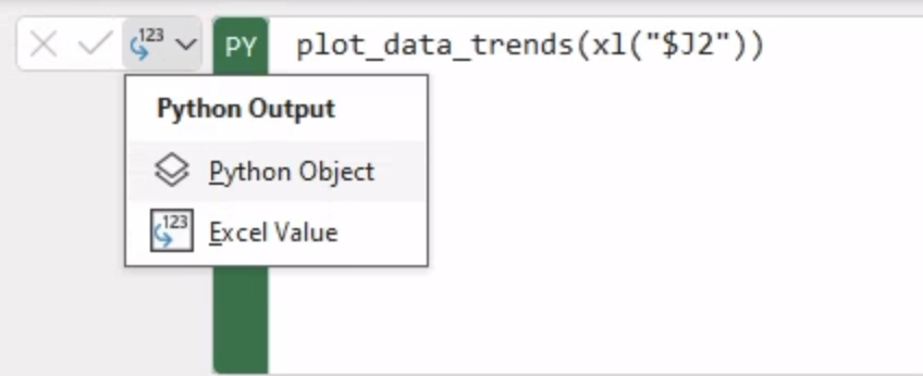
A quick note about Python cells output before proceeding. At the time of writing, the default output mode of a Python cell is Python Object (see picture below). This mode displays the generated images in the cell as “Image Object”.
However, in this case, we are more interested in actually looking at the images. To do so, let’s select all seven cells, and switch their output mode to “Excel value” all at once. This will display the generated plots as shown in the picture below. From now on, we will assume to switch to “Excel value” every time we generate a new plot in Excel.
For more information about Python cell outputs, and their integration with Excel, I recommend checking out this blog article, 5 Quick Tips for Using Python in Excel.
Decomposing Our Time Series
One of the most common analyses for time series is decomposing it into multiple parts. The parts we can divide a time series into are level, trend, seasonality, and noise. All series contain level and noise but seasonality and trend are not always present. These 4 parts can be combined either additively or multiplicatively into the time series. Identifying each one of the different parts of the time series, and their behavior in the data, may affect your models in different ways. The Python statsmodel provides a seasonal_compose() function to automatically decompose a time series, after specifying whether the model we want to use to combine the data is either additive or multiplicative. Let’s create a new worksheet called “Time Series Components.” Next let’s move to the top left cell A1 and write the following Python code, using statsmodel.seasonal_decompose.from statsmodels.tsa.seasonal import seasonal_decompose
import matplotlib as mpl
# Adjust the styling of the plot with Matplotlib
mpl.rcParams['axes.labelsize'] = 14
mpl.rcParams['xtick.labelsize'] = 12
mpl.rcParams['ytick.labelsize'] = 12
mpl.rcParams['text.color'] = 'k'
mpl.rcParams['figure.figsize'] = 18, 8
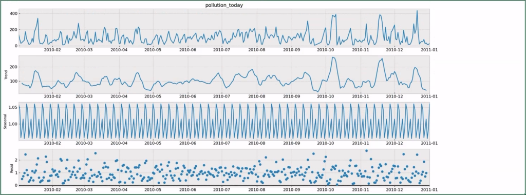
series = air_pollution.pollution_today[:365]
result = seasonal_decompose(series, model='multiplicative')
result.plot()After importing the necessary packages, the first few lines in the snippet are only necessary to set up a few parameters for the plot generated using matplotlib. The important lines are the last three: we gather the values of pollution_data over the first year (2010, first 365 days), and then we decompose the time series in three parts: trend, seasonal, and residual. These parts are respectively represented in the generated graph shown below, as also indicated by the legend on the y-axis of each plot.
Let’s have a quick look at the trend in our data, to further explore the potential of working with Python in Excel.
A trend in our data is present whenever there is an increasing or decreasing slope observed in the time series. Generally, we want to get rid of trends in data, as this would allow us to isolate any seasonality present in the data, pulling out the periodic content of the time series.
It is finally the time to further expand our Pythonic skills in Excel, and try some methods to check for trends in our series. In a few lines of Python, we will try:
- Automatic decomposing
- Moving average
- Fit a linear regression model to identify a trend
Let’s move on A2 cell, and write the following Python code after =PY. Please note that we will reference those methods in code comments for clarity. Also notice that the result Python variable referenced in the code is the same defined in the previous cell, accessible via the shared global namespace of Python in Excel.
import numpy as np
from sklearn.linear_model import LinearRegression

fig = plt.figure(figsize=(15, 7))
layout = (3, 2)
pm_ax = plt.subplot2grid(layout, (0, 0), colspan=2)
mv_ax = plt.subplot2grid(layout, (1, 0), colspan=2)
fit_ax = plt.subplot2grid(layout, (2, 0), colspan=2)

# 1. Automatic decomposition trend
pm_ax.plot(result.trend)
pm_ax.set_title("Automatic decomposed trend")

# 2. Moving Average
mm = air_pollution.pollution_today.rolling(12).mean()
mv_ax.plot(mm)
mv_ax.set_title("Moving average 12 steps")

# 3. Linear Regression
X = np.arange(len(air_pollution.pollution_today))
X = X[:, np.newaxis]
y = air_pollution.pollution_today.values
model = LinearRegression()
model.fit(X, y)

# calculate trend and generate the plot
trend = model.predict(X)
fit_ax.plot(trend)
fit_ax.set_title("Trend fitted by linear regression")

plt.tight_layout()
This may take a few seconds to complete, and you should be seeing graphs as reported below in a unique plot:
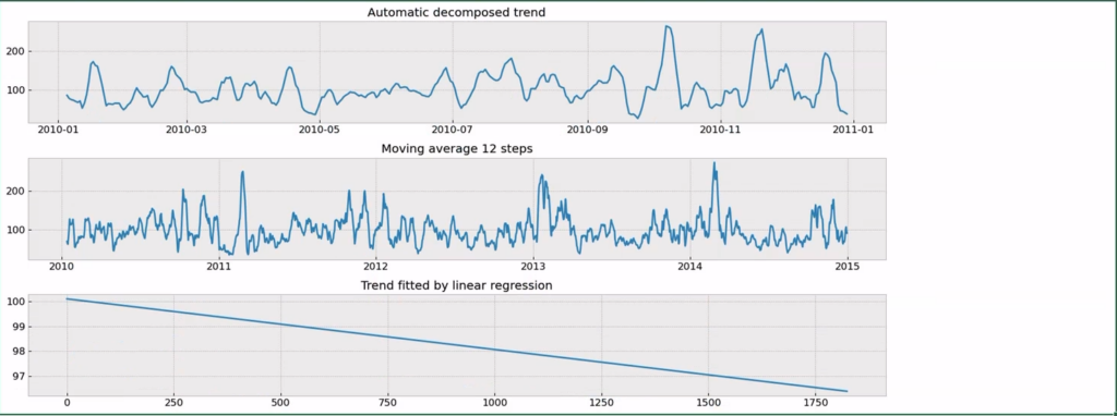
We can see that our series does not have a strong trend, which is good news as this means there isn’t much data cleaning we need to do. Results from both the automatic decomposition and the moving average look more like a seasonality effect + random noise than a trend. This is further confirmed by the linear regression plot (the third from the top) which generates a poor trend.
Time Series Modelling
Let’s now move on to the last step in our time series modeling with Python in Excel, and let’s explore how we can set up and run time series forecasting with ARIMA in Python for our data.
Let’s first create a new modeling worksheet, named “Modeling.”
First, we must prepare our data for modeling, by creating a training and a test data partition. These two partitions (i.e., two disjoint subsets) will be respectively used to train our forecasting model and to check how the model is performing on future predictions on unseen (test) data.
In the A1 Python cell, write the Python code below:
RANDOM_SEED = 12345
np.random.seed(RANDOM_SEED)

split_date = '2014-01-01'
df_training = air_pollution.loc[air_pollution.index <= split_date]
df_test = air_pollution.loc[air_pollution.index > split_date]
f"Data Partitioning: {len(df_training)} days of training data - {len(df_test)} days of testing data"
Since we are dealing with temporal data, the data partitioning will be applied based on a reference date in time, in our case the 2014-01-01. All data before that date will be used for training our model. All days afterward, to test model forecasting capabilities.
As output of that cell, this is what you should be getting:
Data Partitioning: 1461 days of training data – 364 days of testing data
Let’s now try two forecasting models on our data, SimpleExpSmoothing and ARIMA, using the Statsmodel, which is one of the core libraries of Python in Excel.
Statsmodel is the standard for time series modeling in Python, however, its API can be tricky for beginners. Therefore, I’ve included a working code example as a starting point to help you get started faster.
The good news is that the same code can be used for both the considered methods (only the single line invoking the selected method will be changed). I have included comments in the following code so you can follow along for a better understanding. The second code example will simply switch the line calling the SimpleExpSmoothing with ARIMA.
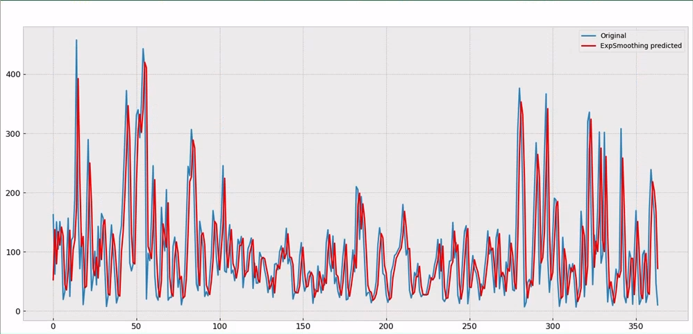
In cell A2, let’s write the following Python code to forecast air pollution using Simple Exponential Smoothing. The analysis plan is to walk through the test data, train the model, and predict 1 day ahead at a time, then repeat the process for all days in the test samples. See the comments in the code to follow along the multiple steps.
from statsmodels.tsa.holtwinters import SimpleExpSmoothing
# let’s create a list holding generated predictions by the model
yhat = list()

# Iterate over the multiple time steps in test data (days, in this case)
for t in range(len(df_test.pollution_today)):
    # Compose the training sequence (temp_train) by adding to the whole
    # training data one single time step (t), i.e. day
    temp_train = air_pollution[:len(df_training)+t]
    # Instantiate the prediction model, SimpleExpSmoothing with temp_train
    model = SimpleExpSmoothing(temp_train.pollution_today)
    # fit the model, and generate predictions
    model_fit = model.fit()
    predictions = model_fit.predict(start=len(temp_train),
                                    end=len(temp_train))
    # Store the generated predictions
    yhat = yhat + [predictions]

# Stack together all the generated predictions
yhat = pd.concat(yhat)
# Let’s finally generate the plot with test data, and generated predictions
fig = plt.figure()
plt.plot(df_test.pollution_today.values, label="Original")
plt.plot(yhat.values, color='red', label="ExpSmoothing predicted")
plt.legend()
fig
The final result is reported below:
Now it is time to try our ARIMA model. In a different cell, say B2 let’s write the following code. Please note that the only few differences in the code are highlighted in bold:
from statsmodels.tsa.arima.model import ARIMA
yhat = list()
for t in range(0, len(df_test.pollution_today)):
    temp_train = air_pollution[:len(df_training)+t]
    model = ARIMA(temp_train.pollution_today, order=(1, 0, 0))
    model_fit = model.fit()
    predictions = model_fit.predict(start=len(temp_train),
                                    end=len(temp_train),
                                    dynamic=False)
    yhat = yhat + [predictions]

yhat = pd.concat(yhat)
fig = plt.figure(figsize=(14, 8))
plt.plot(df_test.pollution_today.values, label='Original')
plt.plot(yhat.values, color='red', label='ARIMA predicted')
plt.legend()
fig
This code produces the following result using the ARIMA model.
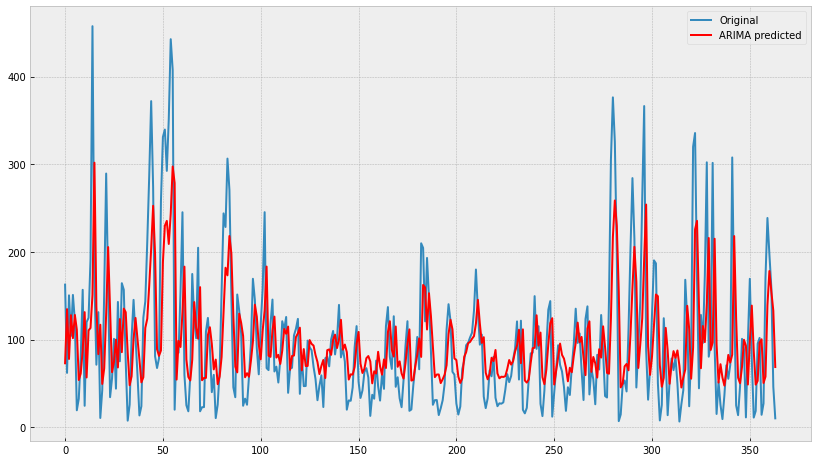
Note: Executing this cell will take some time, as the ARIMA model is more complex, and the dataset is not a small one. If it takes too much time on your computer to finish, you can reduce the number of steps in the prediction, for example, the number of days considered in the test set. In other words, replacing the outer loop with the following line, only considering the next quarter (90 days):
for t in range(0, len(df_test.pollution_today[:90]))Conclusion
In this post, we have explored the great potential offered by the new Python in Excel integration when working with time series data, for analysis and forecasting. Thanks to its natural integration with Anaconda Distribution, the new integration allows users to access packages like numpy, scikit-learn, and stats models directly within the Excel workbook, allowing us a brand new way to process temporal data in Excel.
The final version of the air_pollution_with_python.xlsx Workbook can be publicly downloaded here.
Disclaimer: The Python integration in Microsoft Excel is in Beta Testing as of the publication of this article. Features and functions are likely to change. Don’t hesitate to reach out if you notice an error on this page.
Bio
Valerio Maggio is a researcher and data scientist advocate at Anaconda. He is also an open-source contributor and an active member of the Python community. Over the last 12 years, he has contributed to and volunteered at many international conferences and community meetups like PyCon Italy, PyData, EuroPython, and EuroSciPy.